I’m pretty sure I’m not in their target audience, but my main takeaway from this video is that now, with easel.ly, you don’t need time, money, or skill to make quality infographics. And the prezi-like video seems fitting.
 Maybe I’m just stuck in my ways, but I’m having trouble getting on board with these tools. Easel.ly, for example, provides themes, such as the one on the right. There’s a guy in the middle with graphs around him and pointers coming out of his body. You get to edit however you want.
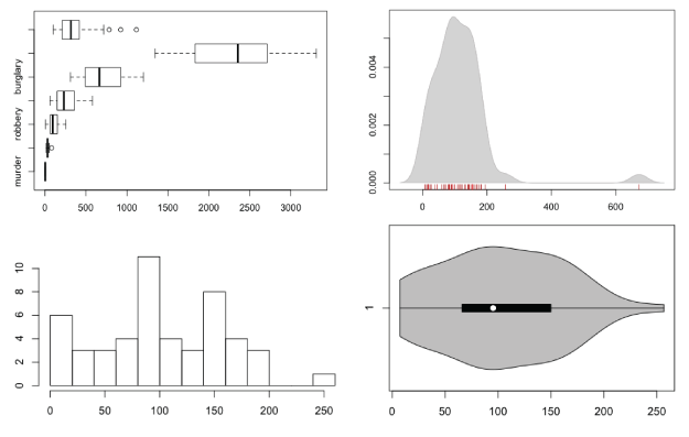
So in this case, you start with a complete visual and then work your way backwards to the data, which I’m not sure how you can edit other than manually changing the size of the graphs. (Working with the interface takes some patience at this stage in the application’s life.) It’s rare that good graphics are produced when you go this direction.
Instead, start with the data (or information) first and then build around that — don’t try to fit the data (or information) into a space it wasn’t meant for.
Or maybe there’s a lot more in store that we can’t see yet. Either way, right now, the application is rough at best.
 Visualize This: The FlowingData Guide to Design, Visualization, and Statistics (2nd Edition)


