By way of reddit, analog traces, or as they’re more commonly known: dirt.
By way of reddit, analog traces, or as they’re more commonly known: dirt.
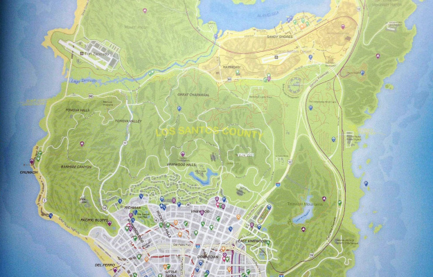
With just five days left until Grand Theft Auto 5 is out, a map of the game’s landscape was leaked, whatever that means these days. It’s almost as detailed as Mario Brothers.
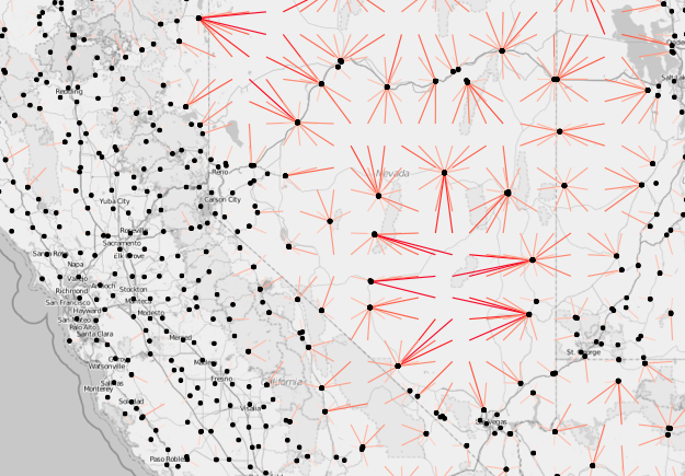
A frequent challenge of visualization is behind the scenes, to get the data and to mold it into the format you need. Do that. Then map.
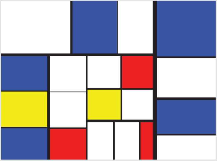
Ben Shneiderman invented the treemap in the 1990s to visualize the hierarchical contents of his hard drive. In the Treemap Art Project, Sheiderman approaches the tool from an artistic perspective. Each treemap in the 12-piece collection visualizes an actual dataset in a familiar artist’s aesthetic.
Colored rectangular regions have been a popular theme in 20th century art, most notably in the work of Piet Mondrian, whose work was often suggested to have close affinity with treemaps. Not all his designs are treemaps, but many are. His choice of colors, aspect ratios, and layout are distinctive, so simulating them with a treemap is not as trivial as you might think. Gene Davis’ large horizontal paintings with vertical stripes of many colors were more easily generated with treemap layouts. The rectangles in Josef Albers “Homage to the Square” or Mark Rothko’s imposing paintings are not treemaps, but generating treemap variants triggered further artistic explorations. Other modern artists such as Kenneth Noland, Barnett Newman, and Hans Hofmann gave further provocations to the images in this collection.
[Thanks, Ben]
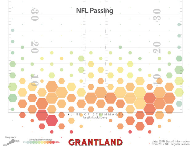
Kirk Goldsberry, known for his basketball analysis and shot charts, has applied his talents to football passes relative to the line of scrimmage. (Football, a.k.a the sport that I might as well watch until basketball starts again.)
More than 68 percent of the league’s passes are short throws that target receivers either behind the line of scrimmage or within 10 yards of it. Some may find it surprising that many of the league’s passes target players behind the line of scrimmage. But screen passes and checkdowns are relatively common. Regardless, the most common throws by far are those short positive-yardage attempts.
I sense player-by-player pass maps in the works.
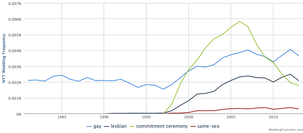
Weddings are special events where friends and family come together to celebrate, and we encapsulate them in their special day. What if you looked at weddings over time though? Todd Schneider provides a view into wedding announcements in The New York Times in Wedding Crunchers, and although the announcements are mostly New York-based, you get a peek into events and social trends. Simply enter terms or phrases and see the trends over time.
Be sure to check out Schneider’s detailed description and highlights of the data. [Thanks, Todd]
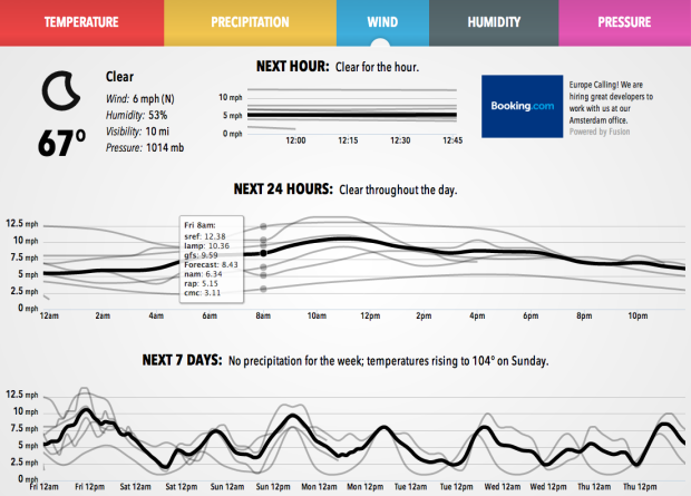
Forecast, one of the best if not the best quick-look weather sites, uses various weather models to predict temperature, wind, humidity, and pressure. Whereas the main result is an estimated map view along with highs and lows for the week, Forecast Lines shows you the the weather models that drive the site.
Forecast works by statistically aggregating a number of different weather models into a single forecast. Because I can peek under the hood, I was able to take a look at all the raw models and see how many dipped below freezing. I saw that none of them did, which gave me confidence that my plants would be okay.
Today we’re launching a new weather app that lets everyone “peek under the hood.” We’re calling it Forecast Lines.
And like the main Forecast site, it works fine and dandy on your iPad or mobile device.
There is a possibility the UK Census is scrapped for cheaper options next year.
The census faces its biggest shake-up in its 200-year history under Office for National Statistics proposals.
An online survey could replace the study – carried out every 10 years – or information could instead be collated using data already held by government.
The plans will be fleshed out and put out to consultation this month before Parliament makes a decision in 2014.
This is both surprising and expected. On the one hand, a decennial Census provides a granular view of a nation that is hard to match. However, on the other, it can be expensive to count everyone, and there are more data sources now than there were 200 years ago that can be drawn upon. The catch is that a lot of data sources use the Census as a baseline or a seed to make estimates.
The main issue seems to be cost, which is estimated to be £482 million over a ten-year period and comes out to about $1.10 per person per year. In contrast, the 2010 United States Census cost $13 billion, which comes out to about $4.20 per person per year. So it’ll be interesting to see what the ONS decides, as I’m sure it’s going to get US officials thinking about prices, too, especially since the US Census cost almost four times more per capita.
In any case, hopefully the UK Census sticks around. A complete cut of the program can’t possibly be beneficial at this point.
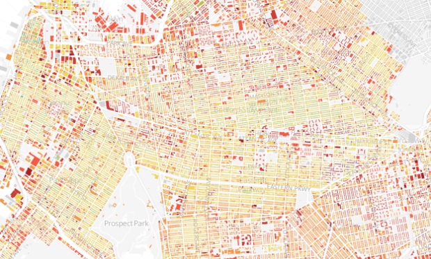
When we think about the age of cities, it’s common to think of when it was founded or established. However, the growth of a city is often more organic, as buildings and homes spring up at different times and different areas. So when you map buildings by when they were built, you get a sense of that growth process. Thomas Rhiel did this for Brooklyn.
Read More
In 1953, the BBC filmed a train ride from London to Brighton and then did the same thirty years later from the same point of view. They did it again this year. The video below shows all three rides side-by-side.
We’ve seen that we can learn from what people search for, through the…
For this rainy Labor Day, here’s an uplifting talk by DataKind founder Jake Porway. He talks data and how it can make a worthwhile difference in areas that could use a change.

There are a lot of poorly conceived graphics that make little sense or do the opposite of what they’re supposed to do. You know what I’m talking about. We see them often. You can either (1) get upset and overreact a bit; or (2) you can laugh. The latter is more fun, and that is the premise of the new Tumblr WTF Visualizations. Enjoy.
Pro tip: When you Google “define <INSERT WORD HERE>” and open the information card, you can see the etymology of the word in flowchart form and word usage over time.
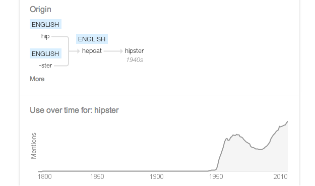
[via @wattenberg]
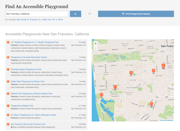
NPR digs into accessible playgrounds, because everyone should get to play.
Remember running around the playground when you were a kid? Maybe hanging from the monkey bars or seeing who could swing the highest?
It wasn’t just a mindless energy burn. Many have called play the work of childhood. Play teaches children how to make friends, make rules and navigate relationships.
But for kids whose disabilities keep them from using playgrounds, those opportunities can be lost.
New federal requirements under the Americans with Disabilities Act are changing the landscape for public playgrounds, requiring them to include equipment, materials and designs that provide children with disabilities the same play opportunities as typical children.
Be sure to look at the app, which serves as both a way to find the nearest playground near you and as a way for you to help build a reference for parents. They’ve found over 1,200 playgrounds for kids to play at so far.
Andrei Kolmogorov is a name unfamiliar to most, but his work had lasting impact. Slava Gerovitch profiled the mathematician, describing the change in thought towards probability theory, which was once more of a joke than a serious approach to evaluate the world. I especially liked the bit about Kolmogorov’s appreciation for the arts.
Music and literature were deeply important to Kolmogorov, who believed he could analyze them probabilistically to gain insight into the inner workings of the human mind. He was a cultural elitist who believed in a hierarchy of artistic values. At the pinnacle were the writings of Goethe, Pushkin, and Thomas Mann, alongside the compositions of Bach, Vivaldi, Mozart, and Beethoven—works whose enduring value resembled eternal mathematical truths. Kolmogorov stressed that every true work of art was a unique creation, something unlikely by definition, something outside the realm of simple statistical regularity. “Is it possible to include [Tolstoy’s War and Peace] in a reasonable way into the set of ‘all possible novels’ and further to postulate the existence of a certain probability distribution in this set?” he asked, sarcastically, in a 1965 article.
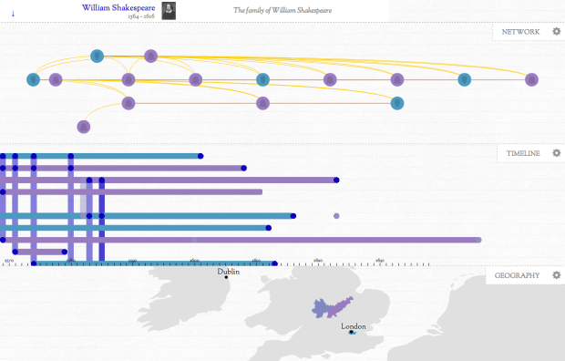
In Kindred Britain, Nicholas Jenkins, Elijah Meeks and Scott Murray provide a visual exploration of how thousands of well-known British people are connected through blood and marriage.
Read More
Statistician (and brand new PhD student) Jerzy Wieczorek explains the usefulness of a master’s degree in statistics.
There’s a huge difference between undergraduate Stats 101 (apply a few standard procedures to nice clean datasets) and real data analysis work (figure out how to clean the data and modify your procedures to the messy context in front of you). So a masters-level mathematical/theoretical stats course, where you learn to prove which estimators have desirable properties or to derive tests that are appropriate in a given situation, is invaluable when you run into non-standard problems. The masters degree will also expose you to many techniques that you probably didn’t cover as an undergrad: designing good experiments, computer-intensive methods like the bootstrap, special-use techniques like time series or spatial statistics, other inference philosophies like Bayesian statistics, etc.
Yep.
Of course Jerzy and me are slightly biased. Saying a master’s degree in statistics isn’t worthwhile is like saying we wasted our time, but if you really want to learn data — whether it’s for analysis, visualization, journalism, or whatever — statistics helps you get there.
And whereas the PhD route takes a certain type of person, most master’s degrees take only two years to finish, and your analysis skills increase exponentially compared to that of an undergrad. Graduate statistics is also way more interesting, because you focus more on practical usage and less on hypothesis tests.
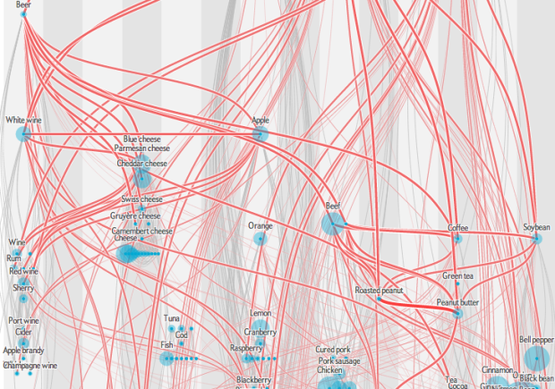
Jan Willem Tulp, for this month’s Scientific American food issue, recreated the flavor network described by Yong-Yeol Ahn, et al.
Julia Child famously said that fat carries flavor, but perhaps instead we should give thanks to 4-methylpentanoic acid. Unique combinations of such chemical compounds give foods their characteristic flavors. Science-minded chefs have gone so far as to suggest that seemingly incongruous ingredients—chocolate and blue cheese, for example—will taste great together as long as they have enough flavor compounds in common. Scientists recently put this hypothesis to the test by creating a flavor map, a variant of which we have reproduced here.
The original by Yong-Yeol Ahn et al was a more traditional network graph. Foods with more similar flavor compounds were closer together. In contrast, Tulp categorizes points in vertical columns by their food group and are placed based on number of shared compounds with other foods.
It’s spaghetti at first, but give it some mental time and filter with the interaction. Start from the top at roasted beef and work your way down.
 Visualize This: The FlowingData Guide to Design, Visualization, and Statistics (2nd Edition)
New tools, refined process.


