Visualization
Showing the stories in data through statistics, design, aesthetics, and code.

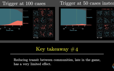
Simulation of droplets while social distancing
Using 3-D simulation data from the Kyoto Institute of Technology, The New York…

Social distancing demonstrated with balls and mousetraps
The Ohio Department of Health released this video to show the advantages of…
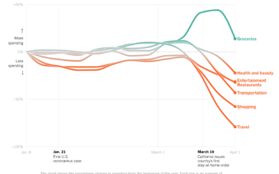
Change in consumer spending since the virus
Consumer spending has shifted dramatically since most people have to stay at home.…
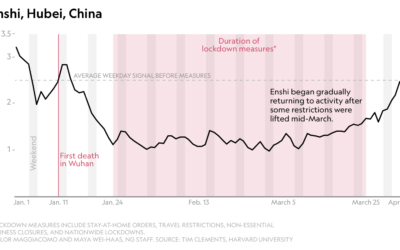
Stay-at-home orders seen through decreased seismic activity
The pandemic has affected all parts of life, which can be seen from…
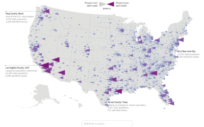
Flow of prison population
In a collaboration between The Marshall Project and The Upshot, Anna Flagg and…
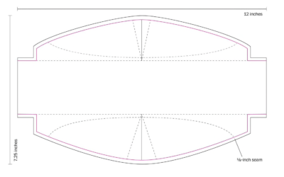
How to sew a mask, with a template
The Washington Post provides clear instructions on how to sew your own mask.…
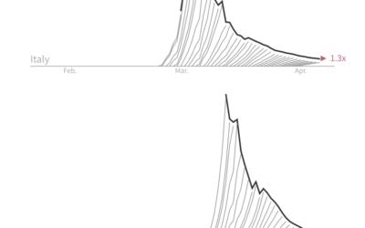
Slowing down the rate of deaths, aka breaking the wave
For Reuters, Jon McClure looks at the death counts for each country from…
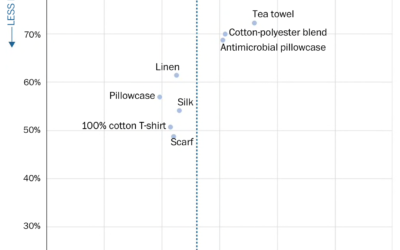
DIY masks, balancing filtration and breathability
The CDC now recommends that you wear a cloth face mask if you…
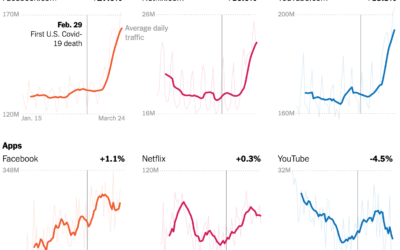
Change in internet usage since the virus
Your schedule changed. The time spent in front of or using a screen…
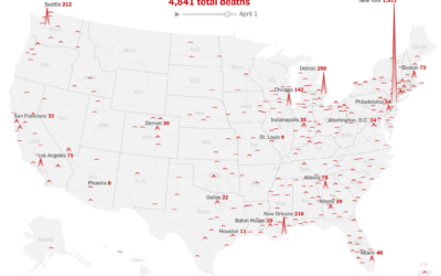
Animated map for total coronavirus deaths over time
For The New York Times, Lazaro Gamio and Karen Yourish use an animated…
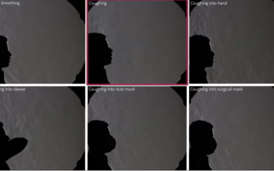
Different cough coverings, varying air spread
From researchers at Bauhaus-University Weimar, this video shows how various methods of covering…
Social distancing isn’t available for everyone
For Reuters, Chris Canipe looks at social distancing from the perspective of household…
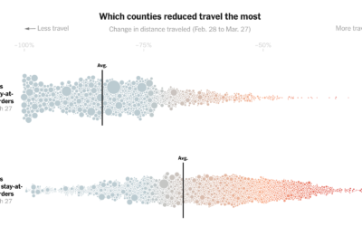
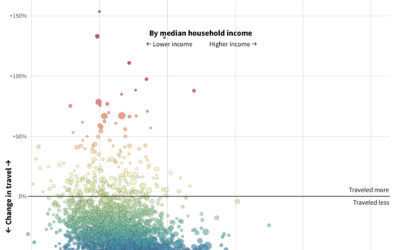
County stay-at-home orders and change in distance traveled
Based on cellphone data from Cuebiq, The New York Times looked at how…
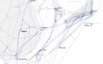
Maps of grounded flights after Covid-19
As you would expect, not many people are flying these days. The Washington…
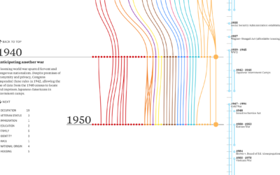
Evolution of Census questions
On the surface, the decennial census seems straightforward. Count everyone in the country…
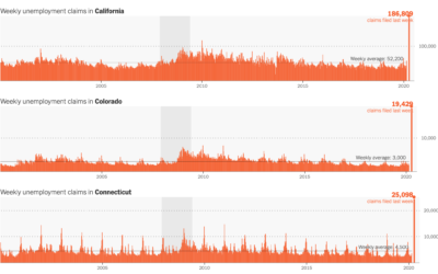
Unemployment spike
The Department of Labor released the numbers for last week’s unemployment filings. 3.28…