Visualization
Showing the stories in data through statistics, design, aesthetics, and code.
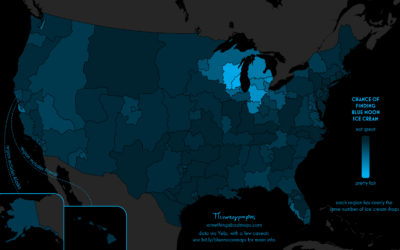
Searching for Blue Moon ice cream
Daniel Huffman grew up with an ice cream flavor called Blue Moon. Where…
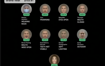
A game where you get to be a faceworker and mess with an AI system
Kyle McDonald, in collaboration with Greg Borenstein, Evelyn Masso, and Fei Lui, made…

Fake faces created by AI and where this might be headed
It’s grown easier and easier to generate fake faces with AI. For The…
Where there are hospital staff shortages
Reporting for NPR, Sean McMinn and Selena Simmons-Duffins on staffing shortages:
On data…
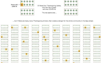
Why small gatherings can be dangerous too
A small gathering of 10 people or fewer can seem like a low-risk…
Analysis of representation in crossword puzzles
For The Pudding, Michelle McGhee analyzed representation in crossword puzzles. Some crossword publications…
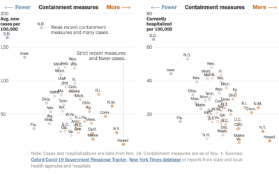
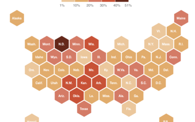
State restrictions and hospitalizations
The University of Oxford’s Blavatnik School of Government defined an index to track…
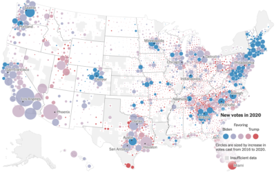
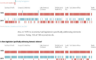
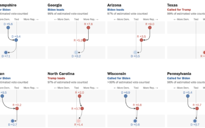
Voting gains for 2020, compared to 2016 election
For The New York Times, Ford Fessenden, Lazaro Gamio and Rich Harris go…
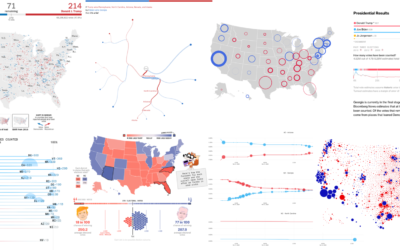
Recap of all the election maps and charts
Alan McConchie from Stamen recaps the wide array of maps and charts that…
An atlas for the world’s development indicators
The World Bank tracks global development through a number of indicators. (You can…
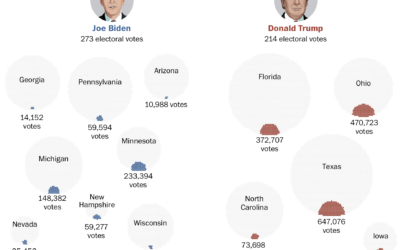
Votes that won the presidency
Voter turnout this election was higher than it’s been in a long time,…
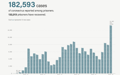
Coronavirus cases rising in prisons
Coronavirus cases are rising (again), which includes prisoners and prison staff. The Marshall…
Minimalist creative coding environment
tixy.land is a minimalist coding environment by Martin Kleppe:
Control the size and…
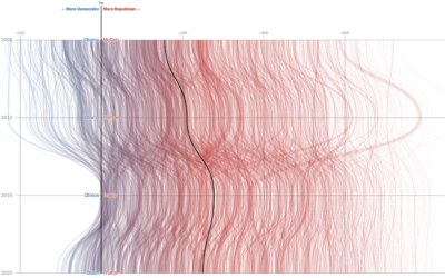
Swings in the battleground states
For The Washington Post, Ashlyn Still and Ted Mellnik show the shifts in…
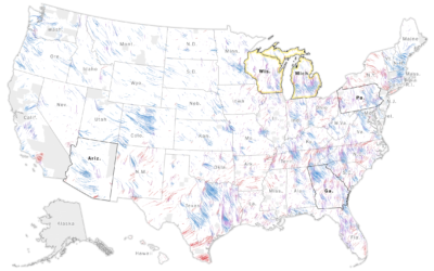
Wind map to show change in vote shares and participation
The Washington Post goes with a wind metaphor to show the change in…
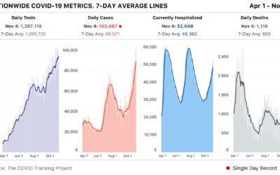
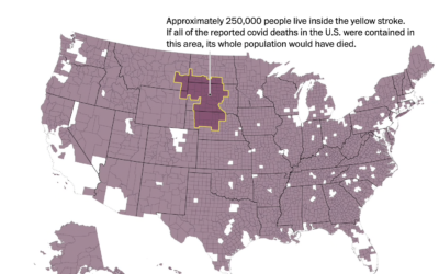
Spike past 100k Covid-19 cases in a day
Meanwhile… based on estimates from The COVID Tracking Project, the United States had…