Visualization
Showing the stories in data through statistics, design, aesthetics, and code.
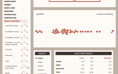
Comparing live music recordings against the studio versions
There’s something about hearing music live no matter how many times you’ve heard…
Tracking Capitol rioters through their mobile phone data
For NYT Opinion, Charlie Warzel and Stuart A. Thompson returned to the topic…

Pandemic Graphics Archive
The Pandemic Graphics Archive is a work-in-progress collection of floor signs and posters…
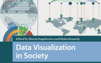
Data Visualization in Society
Data Visualization in Society, an open access book, is a collection of works…

Sonification of Covid-19 deaths
This is interesting:
What does 425,000 Covid deaths sound like? I was inspired…
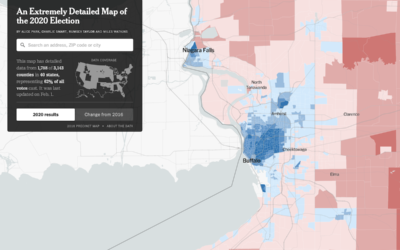
Precinct-level map of 2020 election results
NYT’s The Upshot published their precinct-level map of 2020 election results. Zoom in…
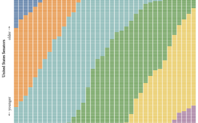
Age generations in the U.S. Senate, over time
With this straightforward unit chart, wcd.fyi shows which generation each Senate member belonged…
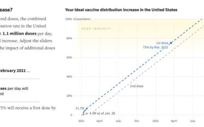
When the U.S. could be vaccinated
For Reuters, Feilding Cage, Chris Canipe and Prasanta Dutta made an interactive that…

Snowflake generator
Vivian Wu made a snowflake generator. Adjust parameters such as growth, kaleidoscoping, and…

Dot density to show Covid-19 deaths over time
The United States passed 425,000 coronavirus deaths this week. For The New York…

Satellite imagery at a cute angle
Maybe you remember the SimCity-like views through satellite imagery from a few of…

Video series on all the chart types
Jon Schwabish has a new book coming out: Better Data Visualizations. To kick…
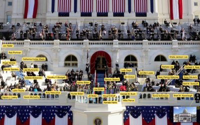
Inauguration attendees labeled
The New York Times labeled all of the people sitting behind Joe Biden…

Scaled-down Biden inauguration
For Bloomberg, Jeremy C.F. Lin and Rachael Dottle show what Joe Biden’s inauguration…


Parler video feed of the mob at the Capitol
As you probably know, there was a big Parler data scrape before the…

Food recipe cards to preserve family’s culture
In an effort to preserve part of her family’s culture, Jane Zhang designed…