Visualization
Showing the stories in data through statistics, design, aesthetics, and code.
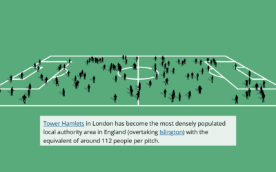
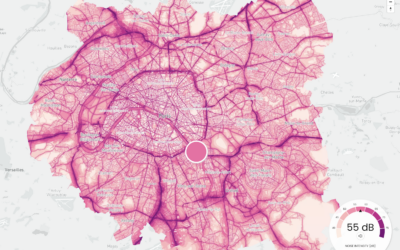
Football field to show population change in the UK
The Office for National Statistics for the UK published an interactive to show…
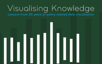
Visualising Knowledge
Visualising Knowledge is an open book from PBL Netherlands Environmental Assessment Agency, based…
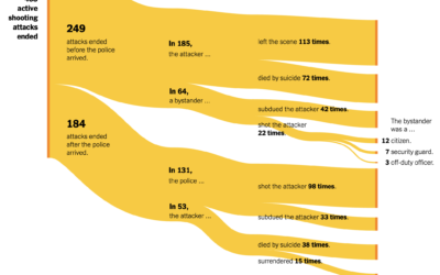
Active shooter endings
For The New York Times, Larry Buchanan and Lauren Leatherby used Sankey diagrams…
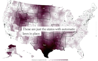
Increased distance to the nearest clinic
With Roe vs. Wade in place, there were areas in the United States…
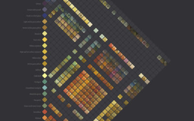
Diagram of watercolors from the 17th century
In 1692, artist A. Boogert published a guide to watercolors, showing the thousands…
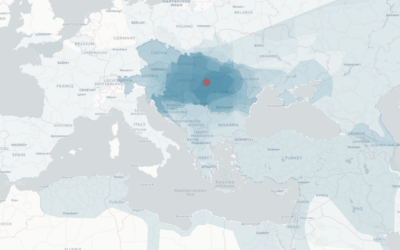
Mapping the boundaries of history
While geographic boundaries can often seem like a semi-static thing, they’ve changed a…
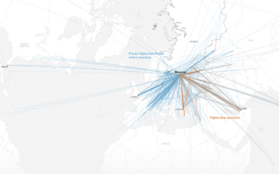
Shifting flight paths for wealthy Russians
For The New York Times, Pablo Robles, Anton Troianovski, and Agnes Chang mapped…
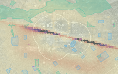
Possible lead exposure around small airports
Thousands of smaller airplanes are still allowed to use leaded fuel, which can…
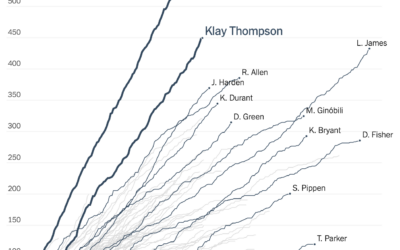
Cumulative 3-pointers for the Splash Brothers
Tonight is game six of the NBA Finals. If the Golden State Warriors…

Hands-On Data Visualization, an open-access book on interactive visualization for beginners
Hands-On Data Visualization, by Jack Dougherty and Ilya Ilyankou, is an open-access book…
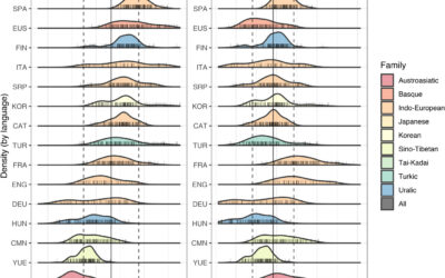
Different languages, but similar information rates
Christophe Coupé and company analyzed speech rate (on the left) across different languages,…

Map of closest airports everywhere
This fun interactive map by William B. Davis shows you the ten closest…
History of heat records in major U.S. cities
Matt Daniels and Russell Goldenberg for The Pudding are tracking heat records in…

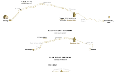
Calculating the new cost of your summer road trip
With gas prices a lot higher than usual, Júlia Ledur, Leslie Shapiro, and…