Visualization
Showing the stories in data through statistics, design, aesthetics, and code.
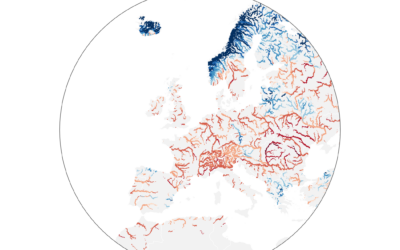
Worst drought in Europe, in 500 years
Dominic Royé mapped river discharge in Europe over the past few months:
A…
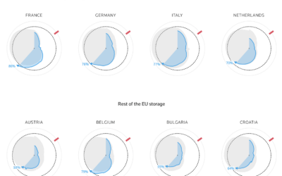
How much gas European sites have stored for the winter
Reuters goes with the radar chart to show gas supplies, as European countries…
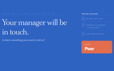
Tracked while reading about being tracked at work
While reading this NYT article, by Jodi Kantor and Arya Sundaram, on the…
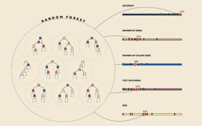
Visual explanations for machine learning
As part of a teaching initiative by Amazon, MLU-Explain is a series of…
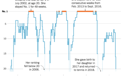
Serena Williams’ career rankings
Serena Williams announced her retirement from professional tennis. As is required for any…
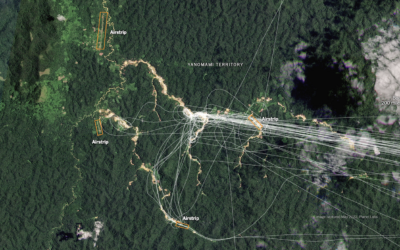
Finding illegal airstrips in Brazil
Using a combination of satellite imagery, crowdsourced databases, and analyses, The New York…
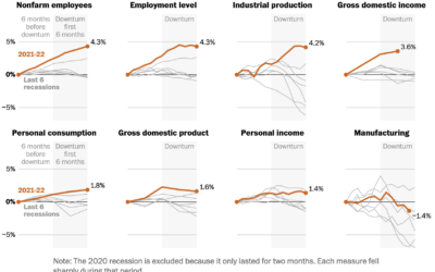
Indicators for a recession
People disagree whether the United States is in a recession or not, because…
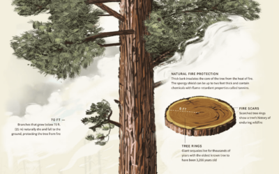
Sequoia tree wildfire protection
For Reuters, Travis Hartman, Ally J. Levine, and Anurag Rao describe the measures…
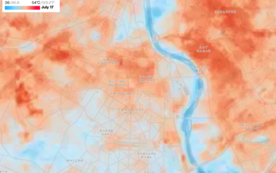
Mapping the cool spots in hot cities
As city centers heat up, people search for cooler areas. For Bloomberg Green,…
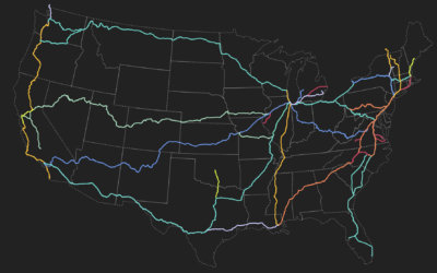
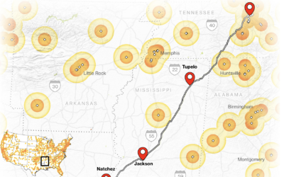
Amtrak train route explorer
This visual explorer by Rachel Binx lets you see Amtrak routes and stations…
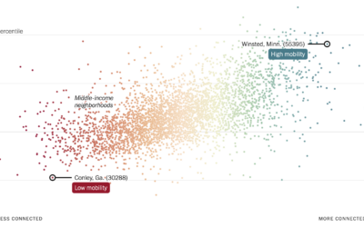
More friendships between rich and poor might mean less poverty
Recently published in Nature, research by Chetty, R., Jackson, M.O., Kuchler, T. et…
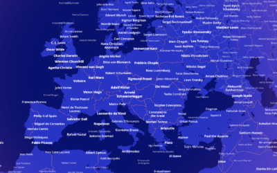
Most notable person, everywhere in the world
Who is the most famous person born in the place you live? This…
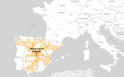
Mapping how far you can travel by train in five hours, from any European station
This European travel map by Benjamin Td shows how far you can travel…
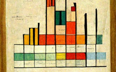
Data visualization(-ish) in the style of famous artists
DALL-E is an AI system from OpenAI that creates images from text. You…
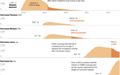
Housing displacement after disasters
Christopher Flavelle, for The New York Times, reported on the lack of support…
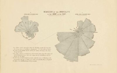
Florence Nightingale’s use of data visualization to persuade in the 19th century
For Scientific American, RJ Andrews looks back at the visualization work of Florence…
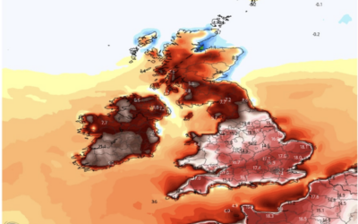
A plea to stop climate change from the guy who makes maps
For Washington Post Opinion, a struggling mapmaker makes a plea to stop climate…