Visualization
Showing the stories in data through statistics, design, aesthetics, and code.
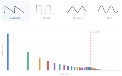
How synthesizers work, a visual guide
Shri Khalpada, for PerThirtySix, breaks down musical sounds into math to illustrate how…
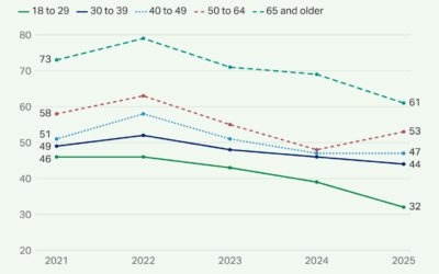
Less than half of U.S. adults have access to quality healthcare
A recent Gallup poll shows less than half of U.S. adults say they…
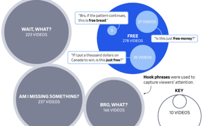
Fake Polymarket winnings
If you’re in the right pocket demographic of a short-form video algorithm, you…
Turning the flag algae green
The renovations to the Washington reflecting pool were supposed to make the water…

Large scale hand-drawn, fictional map
Jerry Gretzinger started a map of a fictional city in 1963 with eight…

Comparing today’s temperature against historical averages
When you have that feeling that today is abnormally hot or cold for…
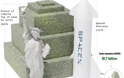
Scale of a one-trillion-dollar pile of money
Going with the old school pile o’ money, NBC News illustrated the scale…

Weakened relationships through the pandemic
The pandemic tested the strength of many relationships. Alvin Chang, for the Pudding,…

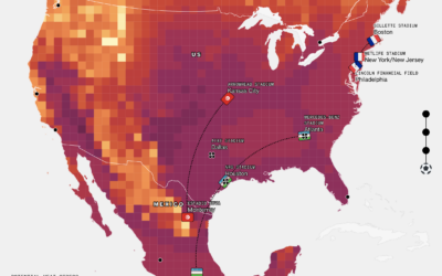
Proposed arch in the path of air traffic
The current proposal for the arch sets the height at 288 feet above…

What $1 trillion buys
Elon Musk became the world’s first trillionaire with the SpaceX initial public offering…
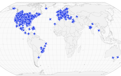
Apocalypse warning system, based on fleeing private jets
The Apocalypse Early Warning System by Kyle McDonald was built on the premise…
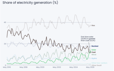
Solar passes coal for US electricity
Another recent flip: Based on estimates from Ember, monthly solar-generated electricity reached an…
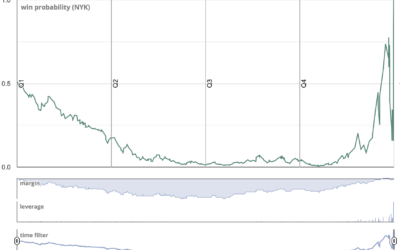
Flip in win probability for Knicks vs. Spurs
Speaking of when data flips, last night in game four of the 2026…
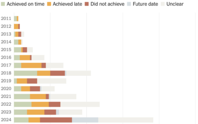
Elon Musk’s promise achievement rate over the years
The New York Times counted Elon Musk’s promises on X/Twitter and Tesla earnings…

Overlap of endangered whale calls with sonic blasts
Companies use seismic airguns in the Gulf of Mexico to find oil and…

Melting glaciers in the Alps
For Bloomberg, Laura Millan, Kyle Kim, and Armand Emamdjomeh mapped the projected extent…
What LLM speed looks like when generating output
LLM speed is commonly expressed as tokens per second, which is kind of…