Visualization
Showing the stories in data through statistics, design, aesthetics, and code.
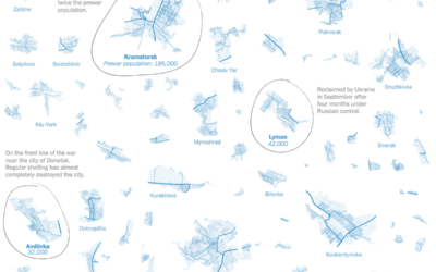
Areas still controlled by Ukraine
For The New York Times, Josh Holder and Marco Hernandez show the areas…
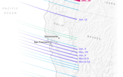
Science behind California rains
It rained a lot more than usual this winter in California. Diana Leonard…
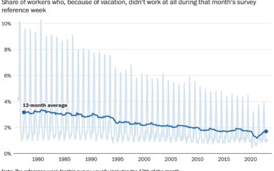
Declining vacation time from work
Despite available vacation days, it appears that American workers are taking less and…
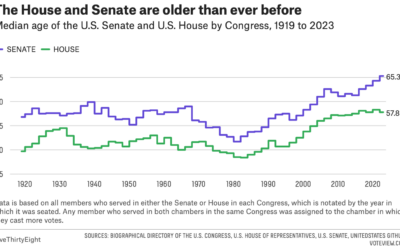
Congress still getting older
For FiveThirtyEight, Geoffrey Skelley digs into the ongoing trend:
What’s behind these increasingly…
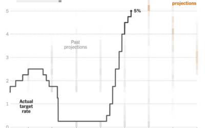
Changing Fed projections
This clever chart by Lazaro Gamio shows changing interest rates set by the…
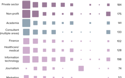
Data Visualization State of the Industry, 2022
The 2022 results from the State of the Industry survey, run by the…

Physics of a bicycle visually explained
Riding a bicycle is a seemingly simple activity that we never forget how…

Mapping where Taylor Swift performs on stage during a show
Taylor Swift is currently on tour. During a show, she sings 44 songs…

Words used in layoff letters
Tech layoffs continue, and as companies deliver more letters, there are some repeated…
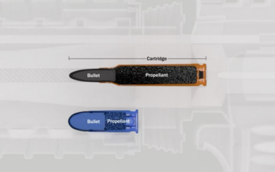
Visual explainer on what an AR-15 does to the human body
This is necessarily uncomfortable to go through, but for The Washington Post, N.…
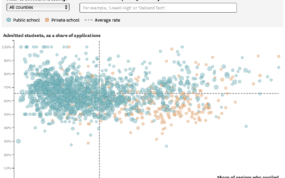
UC admission rates for California public and private high schools
For the San Francisco Chronicle, Nami Sumida shows admission rates at University of…
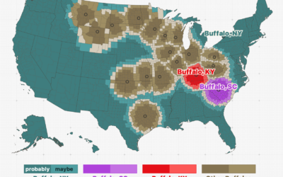
Among cities with the same name, which one people are probably talking about given their location
Throughout the United States, there are a surprising number of cities that have…
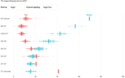
Online dating, who filters out what
With online dating apps, you’re able to filter out potential matches based on…
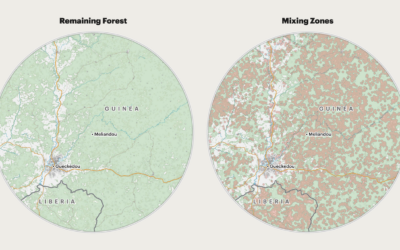
Deforestation and increased risk of outbreaks
For ProPublica, Al Shaw, Irena Hwang, and Caroline Chen explain the increased risk…

Fake sugars in your food
For The Washington Post, Anahad O’Connor, Aaron Steckelberg, and Laura Reiley visually describe…
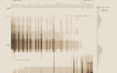
Past and present California drought severity
It’s been raining a lot here in California, which is helpful, because most…