Visualization
Showing the stories in data through statistics, design, aesthetics, and code.
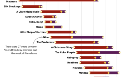
When movies become musicals and then movies again
For The Washington Post, Hanna Zakharenko charted all the movies that were adapted…
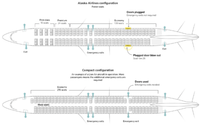
Boeing panel that blew off during flight
A refrigerator-sized panel popped off a Boeing 737 MAX 9 during the ascent…
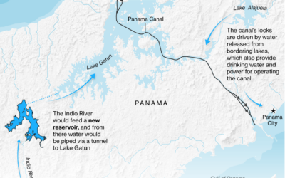
Repairing Panama Canal water levels
For Bloomberg, Peter Millard and Michael D. McDonald report on the efforts to…
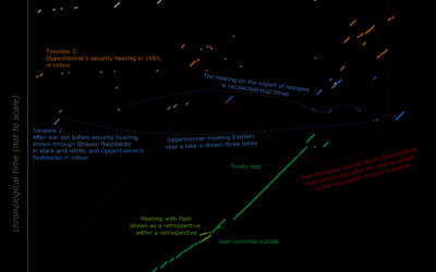
Oppenheimer movie timeline
By Reddit user Pitazboras, a movie timeline for Oppenheimer with running time on…
Best Data Visualization Projects of 2023
Data continues on its upwards trajectory and with it comes the importance of visualization. Many charts were made in 2023. These are my ten favorites from the year.
A phone charger that only works when you recharge yourself
Recharge, an art installation by Dries Depoorter, uses a system that detects when…
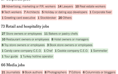
Breaking down the holiday movie formula
NYT’s The Upshot looked at 424 holiday movies released by the Hallmark and…
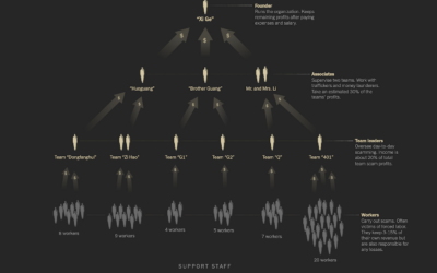
Tracking operations in an online scam labor camp
Neo Lu was scammed into a labor camp. In an effort to escape…
Scale of all the things, compared to you
Kurzgesagt illustrates the scale of the tiniest of things and the biggest of…
Generative plants
Generate your own plant with Max Richter’s interactive. Adjust leaf shape, density, and…
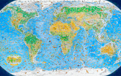
World map of illustrated animals
During a three-year span, Anton Thomas illustrated a world map of 1,642 animals…
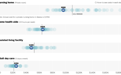
Cost of assisted living where you are
Assisted living can be expensive. For The Washington Post, Bonnie Berkowitz, Lauren Tierney,…
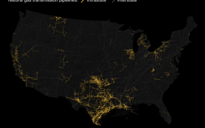
High concentration of intrastate pipelines in Texas
By keeping gas pipelines within the state, companies can avoid federal regulations. This…
Steps for getting started with data visualization
Getting started with data visualization can be tricky because of all the resources…

