Visualization
Showing the stories in data through statistics, design, aesthetics, and code.
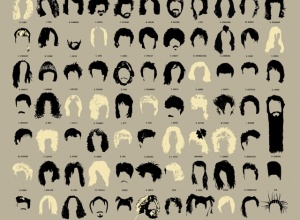
Visual history of hot haircuts in popular music
A Visual Compendium of Notable Haircuts in Popular Music from Pop Chart Lab…
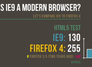
Firefox vs. IE: Is IE9 a modern browser?
Mozilla tech evangelist Paul Rouget has a go at Internet Explorer 9 in…

Vintage literary stature graphic from 1906
Greg Ross highlights an old school graphic from The Strand Magazine, published in…
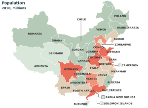
Chinese provinces compared to countries
It’s easy to forget just how big some countries are. For example, China:…
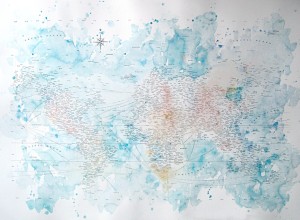
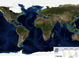
Typographic world map and water colors
Typographic maps are all the rage these days. Instead of drawing well-defined boundary…
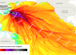
Japanese quake and predicted tsunami wave heights
The New York Times maps the reach of the 8.9-magnitude earthquake in Japan.…
Animation: North and South Poles melting away
Adrian Meyer and Karl Rege of Zurich University of Applied Sciences visualize the…
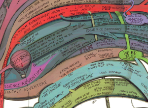
History and origins of science fiction
Artist Ward Shelley maps the history of science fiction in painstaking detail. See…
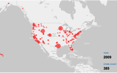
Watching the growth of Costco warehouses
Costco is one of the best stores ever. It’s got everything you need…

Entire movies compressed into single barcodes
Choice of color in a movie can say a lot about what’s going…
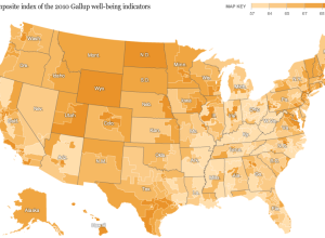
Well-being of the nation mapped
Analyzing Facebook and Twitter updates to gauge happiness is all the rage these…

Countdown to the end of Internet Explorer 6
If you’ve ever designed for the Web, you know what a pain it…
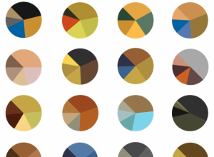
Vincent van Gogh paintings as pie charts
Arthur Buxton breaks down van Gogh paintings for a view of color schemes.…

Most typical person in the world
Continuing their series on world population, National Geographic focuses in on the “most…
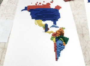
Lego cartograms show immigration and migration
LEGOs were my favorite toy growing up. This was back when the pieces…

German defense minister’s plagiarized PhD dissertation visualized
As some of you might know, Germany’s defense minister, Karl-Theodor zu Guttenberg, resigned…
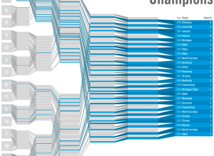
March Madness bracketology – winners and losers
Working off last year’s bracketology graphic, Leonardo Aranda took a simpler approach in…
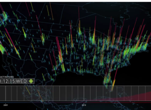
Global Android activations mapped and animated
iPhone gets all the glory, but there are plenty of Android phones activated…