Data Underload
People worry about data overload. Fooey. Charts and musings by Nathan Yau.

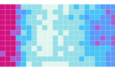
Divorce and Occupation, in 2015
Some jobs tend towards higher divorce rates. Some towards lower. Salary also probably plays a role.
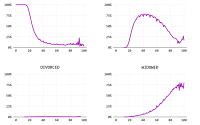
Marrying Later, Staying Single Longer
Using a century of data, we watch the shift of marital status in the United States.

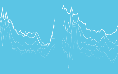
Married People Have More Sex
The relationship and dynamics change. Less lust, more companionship. Is that really how it works?
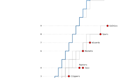
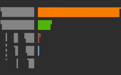
The Warriors’ Championship Path
As expected, this time, the Golden State Warriors won the championship last night.…
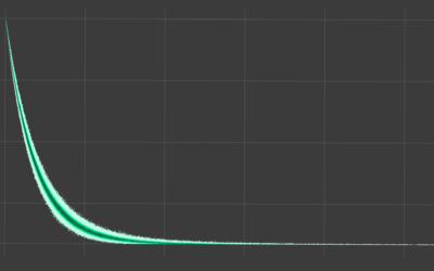
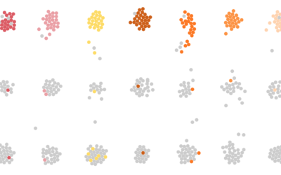
Chances it’s a Friend’s Birthday Every Single Day of the Year
If it seems like every day you log in to Facebook, it’s someone’s birthday, you're probably not that far off.
Giving Up Time as a Parent
There is a fixed number of minutes during the day. Where do parents usually draw the time from?
A Day in the Life: Work and Home
I simulated a day for employed Americans to see when and where they work.
How the Average Working Adult Spends Days
This is what you get when you add up all the days the average American adult spends sleeping, eating, commuting, and doing other activities.
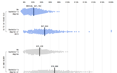
Shifting Incomes for Young People
Compare incomes for young people from the Millennial generation and the baby boomer generation.
Fatal Traffic, When and Where
These are the traffic crashes that resulted in deaths in 2015, categorized by month, time of day, and factors involved.

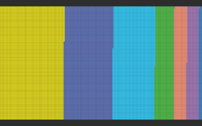
Income Taxes You Would Pay in Each State
Some states have high rates. Some have low. But whether a state is lower or higher for you depends on more than just the high brackets.
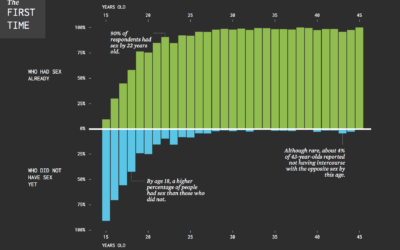
When Straight Americans Lost Their Virginity
Everyone has his or her own timeline, but here it is in general for Americans.
Relationships: The First Time…
When Americans had sex, moved in with someone, and so on. Often not average. Far from normal.

Charting All the Beer Styles
The Beer Judge Certification Program lists 100 styles of beer. Here's a chart for all of them.