While we’re on the subject of stars, developer Riley Davis modeled the ones…
Nathan Yau
-
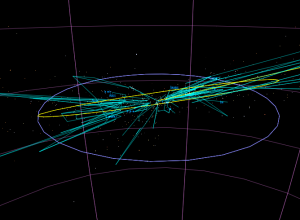
Stars in the zodiac constellations, from Earth and space
-

An interactive view of star constellations
When we look up at the night sky to gaze at the stars,…
-
Link
Process of Creating Data Visualizations →
The usual: get data, analysis, visualize; rinse and repeat
-
Link
8 hats of data visualisation design →
Skills for visualization; see also
-
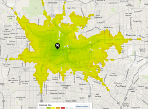
Commute times in your area, mapped
When you look for a place to live, there are outside factors to…
-
Link
Mike Bostock joins NYT →
Great news for both
-
Link
Data we have vs. data we want →
Deciding what analysis results can be expanded to the real world
-
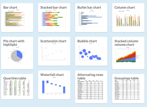
Chart Chooser helps you choose charts
There are a lot of charts to choose from, and if you pick…
-
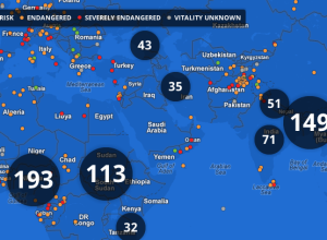
Endangered languages project
Google, in collaboration with Vizzuality, are trying to catalog endangered languages before they…
-
Link
HiveR →
-
Link
The Slow Web →
Value in not knowing everything immediately
-
Link
Google lowers price for Maps API usage →
From $4 per 1,000 loads, down to 50 cents
-
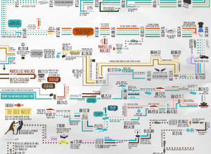
Pulp Fiction presented in chronological order
Smith hopes to put it print. Currently in Kickstarter mode.…
-

857 empty desks on National Mall used to represent high school drop-outs
As part of their campaign to prioritize education and get presidential candidates talking…
-
Link
Peity →
jQuery plugin that converts an element’s content into a mini pie, line, or bar chart [via]
-
Link
Datawrapper →
Open source data visualization, geared towards journalists
-
Link
IBM Predictive Analytics Suite →
New software as they continue on with their Smarter Planet push [via]
-
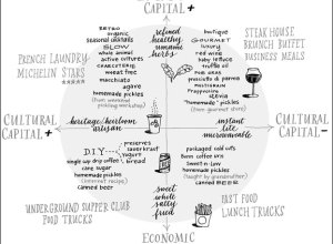
Bourdieu’s Food Space chart, from fast food to French Laundry
In Pierre Bourdieu’s Distinction: A Social Critique of the Judgement of Taste from…
-
Synchronized Swimming in Data and the Water Metaphor
The flood. The avalanche. The tsunami. Drowning in data. For the past few…
-
Link
Doing the Line Charts Right →
Keeping it simple and highlighting what’s important
Recently for Members
Second Edition
 Visualize This: The FlowingData Guide to Design, Visualization, and Statistics (2nd Edition)
 Visualize This: The FlowingData Guide to Design, Visualization, and Statistics (2nd Edition)
New tools, refined process.
Browse by Chart Type See All →


