Visualizing Incomplete and Missing Data
We love complete and nicely formatted data. It means we spend less time restructuring and poking at a sparse dataset and more quickly get to the visualization, analysis, and insights. It’s why I like to work with Census data so much. A lot of time and research is put into making sure the data is as complete as it can be.
But a lot of the time (most of the time?), the data you work with is not complete. There is missing data. Available values can be sparse across time and space the farther out you stretch.
What do you do when this happens? The easy way out is to ignore the gaps completely and just work with what you have.
But maybe you’ll find something interesting if you look into the void. Sometimes the missing data can lead you to something more complete. Here are some solutions to get you headed in the right direction.
Show the Gaps
This is the most straightforward solution and the easiest visual metaphor. Don’t have something? Don’t show it.

Tips
You always want to ask yourself if each element in your visualization is useful. Gaps or white space to show missing data are no different. If the gaps bring more noise than signal, consider designs that make it obvious that the gaps are context rather than the focus.
For example, if color encodes the data, use a color that stands out less. Or, you can be less explicit. If you have a time series, try splitting up the data into even time frames with a chart for each.
Examples
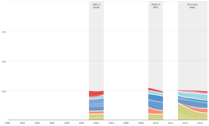
The New York Times visualized where professional athletes come from. For women’s soccer in the United States, leagues came and went over the past few decades, so gaps represent the years leagues didn’t exist.
It’s also a good idea to couple the nothingness with words to explain why the nothingness is there. In this graphic where I daisy-chained jobs to form an imaginary path from one career to another, some jobs didn’t match up. So I showed no connections along with a blurb.
Treat It As a Category
Survey data often contains a “not applicable” category or a respondent chose not to answer a question. It’s often useful to treat this as a separate answer.

Tips
Usually there is a difference between “not applicable” and a non-answer, so resist the initial urge to combine them visually and in your analysis. Check things out before you do it.
If you decide to show a missing data category, a visual cue typically exists to signal that the response is different from the rest. You can use white space to provide separation, you can a neutral color that contrasts with a brighter color scheme, etc.
Examples
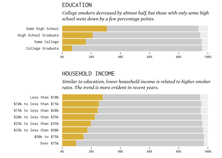
In a survey from the Centers for Disease Control and Prevention, respondents answered whether they smoked or not. Some did not provide an answer, so I showed non-responses in light gray.
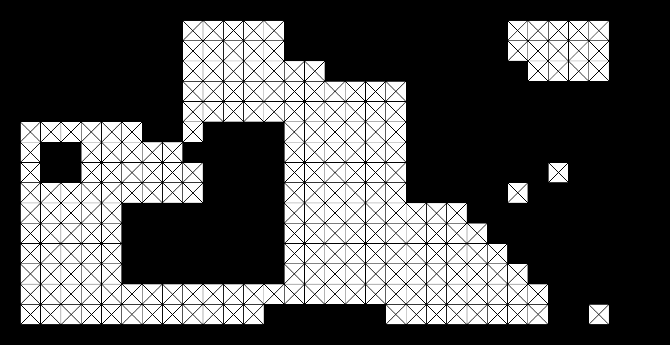
See also the Open Data Index grid from the Open Knowledge Foundation. In this case, missing data is one of the main things to focus on, as the grid highlights governments that provide open data and those who do not.
Zoom Out
Think forest for the trees situation. Zoom into too closely to a dataset, looking at really small subgroups, you might miss the patterns that you’d see by zooming out a bit.

Tips
You always strive for balance. Zoom in to the data for details, but don’t get stuck in them so much that you can’t see the overall picture. Similarly, don’t zoom so far out that you miss out on all the blips and irregularities.
Examples
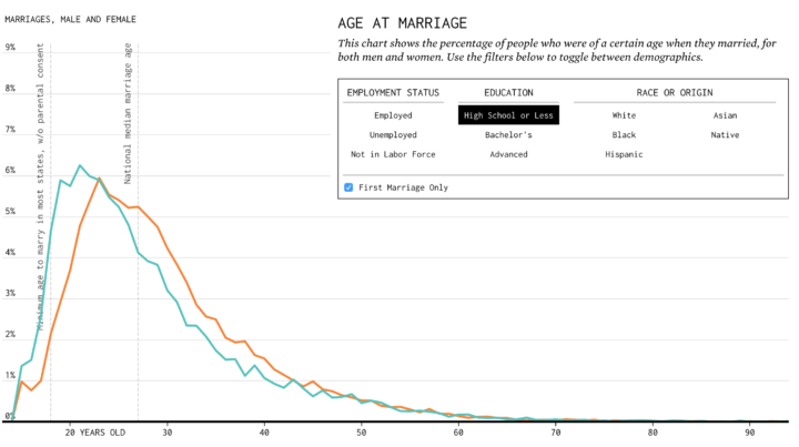
Working with census data, I run into this issue a lot. I look at subpopulations split by age, race, sex, geography, and time. I use the demographic subsets to help readers get “closer” to the data, such as this interactive that lets you select sex, age, and race at the same time.
But when there’s isn’t enough data for granular subsetting, I only provide one filter at a time, such as the graphic on marrying age.
See also all the maps that zoom into a certain range to match the granularity of the data of interest, such as where people use certain words and the map of New York City shadows.
Interpolate
When dealing with irregular or sparse data, a statistical approach is to fill in the gaps in a smart way. This often comes in the form of taking a weighted average of what is around a given point. For example, with geographic data, one might consider the neighbor values of a given location. With time series, one might apply a regression model or a smoother.

Tips
This is an entire branch of statistical research, so be careful with this one. Don’t go filling in missing data values willy-nilly or making uninformed conclusions. It’s often helpful to learn about the methodology behind an interpolation so that you know what your software spits out. It’s also okay to ask a statistician for help.
Examples
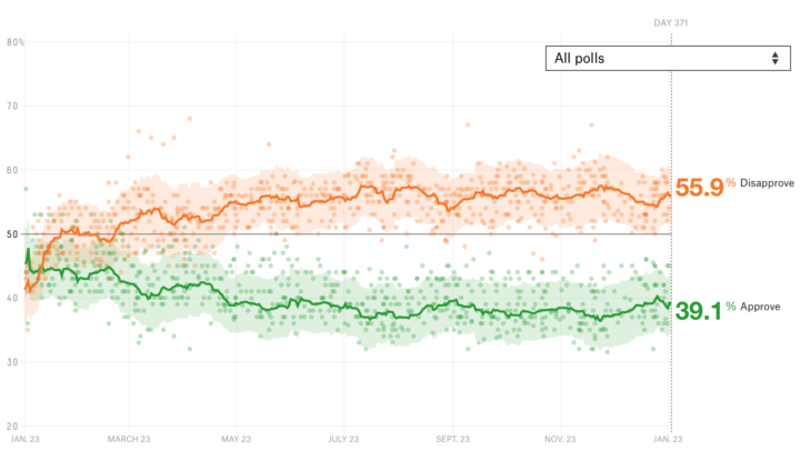
The approval ratings chart from FiveThirtyEight, which aggregates poll results over time, comes to mind.
See also the animated map of unemployment over time.
Focus On What You Have
I find myself telling this to my pre-school age son more often these days. “Stop focusing on what you don’t have, and focus on what you do have.” If there’s too much missing data, shift focus to the data that exists.

Tips
It is also very possible that complete data doesn’t exist for a topic you investigate. It would be nice if it did, but if it doesn’t shift your attention elsewhere. No need to waste time dwelling.
Examples
In mapping the spread of obesity, I showed change from 1985 through 2015. There was data before 1985, but it was too sparse, so I went with was there (and still showed some missing data in gray).
Collect the Missing Data
Sometimes data is missing, not because it doesn’t exist, but because no one collected it yet. Maybe data points exist in various places and it needs to be aggregated.
Tips
Data scraping — using scripts to grab data from web pages — comes in handy here. The NPR Visuals Team put together a useful guide to get started. There are also many places to start looking for data. Oftentimes, it is useful to just ask.
Become a member. Support an independent site. Get extra visualization goodness.
See What You Get
