Divorce Rates and Income
Divorce rates are tied to job security, age, and occupation, so it should make sense that we see a pattern when we plot divorce rates against income.
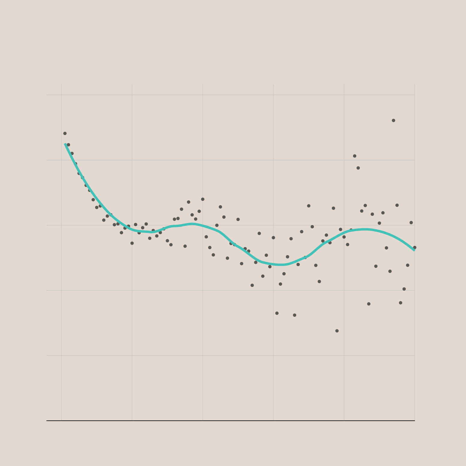
PERCENTAGE
DIVORCED
BY INDIVIDUAL ANNUAL INCOME
OUT OF POPULATION WHO MARRIED AT LEAST ONCE AND EARNED INCOME DURING PAST YEAR
50%
40%
30%
Rates appear to level off around 30 percent.
20%
There is less data at higher incomes, so there is more noise.
10%
0%
$0
$200,000
$400,000
$600,000
$800,000
$1,000,000+
TOTAL ANNUAL INCOME
Compiled from estimates from the 2019 American Community Survey
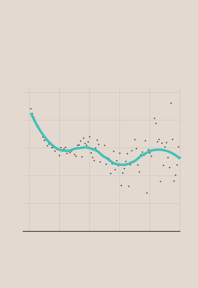
PERCENTAGE
DIVORCED
BY INDIVIDUAL ANNUAL INCOME
OUT OF POPULATION WHO MARRIED AT LEAST ONCE AND EARNED INCOME DURING PAST YEAR
50%
40%
30%
20%
10%
0%
$0
$200k
$400k
$600k
$800k
$1M+
TOTAL ANNUAL INCOME
Compiled from estimates from the 2019 American Community Survey
There’s a tight decrease in divorce rate for incomes between $10,000 and $200,000 per year, and then rates seems to flatten out around 30 percent after that.
There’s some fluctuation showing in the higher incomes. But it’s hard to say if that’s actually what’s happening or if there are just fewer data points at higher incomes to calculate rates. I suspect the latter.
Chart Types Used


Become a member. Support an independent site. Get extra visualization goodness.
See What You Get