From Mike Bostock
2012
-
Link
Sankey diagrams in D3 →
-

Image compositing in TileMill
TileMill is a tool that makes it easy to create interactive maps. Soon…
-
Link
What could revolutionize health care? →
Huge database may help answer the question “Why is health care so expensive?”
-
Link
The fine line between plagiarism and inspiration →
Thoughts on copying, inspiration, and attribution by Andy Kirk
-
Link
Crash course on design thinking →
From Stanford’s d.school
-
Venn pie-agrams
So I got to thinking, since I’m on this pie chart kick, “what…
-
Manuel Lima’s animated talk
Wow, Manuel Lima, Senior UX Designer at Bing, got through a world of…
-
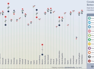
Updated OECD Better Life index
The OECD’s Better Life Index which debuted last year to much fanfare has…
-
Link
Hours, days, who’s counting? →
Jon Udell’s thoughts on quantitative literacy
-
Link
The Weight of the Moon (ball) →
Visuals in public education
-
Data visualization doesn’t matter
Visual.ly analyzed the top 30 infographics posted on their site and determined that…
-
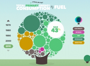
The U.K. energy consumption guide
I’m a sucker for anything cute and bubbly, and the U.K. Energy Consumption…
-
Link
7 Essential Books on Data Visualization & Computational Art →
Visualize This didn’t make the cut, but a good list nonetheless
-
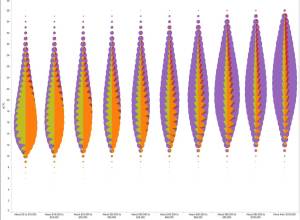
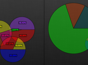
Not so good use of pie charts
I warned Nathan that I was going to drop a pie bomb on…
-
Link
Winners announced →
International Space Apps Challenge
-

Relational ornaments
Gundega Strautmane, a Latvian textile artist and designer, visualizes social and physical networks…
-
Link
This is how we do it →
Infochimps secret sauce
-
Link
New courses from R gurus →
Both in-person and online courses
-
Link
Facebook is worth more than… →
A fun and horrifying plaything from NYT
-
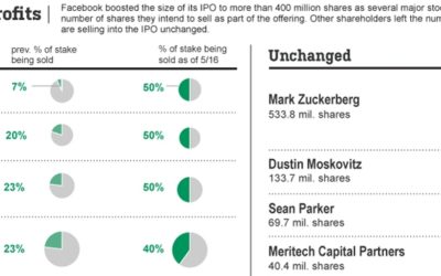
Good use of pie charts
This Wall Street Journal graphic shows who’s selling (or sold) a percentage of…
Recently for Members
Second Edition
 Visualize This: The FlowingData Guide to Design, Visualization, and Statistics (2nd Edition)
 Visualize This: The FlowingData Guide to Design, Visualization, and Statistics (2nd Edition)
New tools, refined process.
Browse by Chart Type See All →


