Visualization
Showing the stories in data through statistics, design, aesthetics, and code.
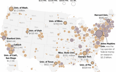
Universities that received federal funding for research
Big universities more often make the news, but the freeze in federal funding…
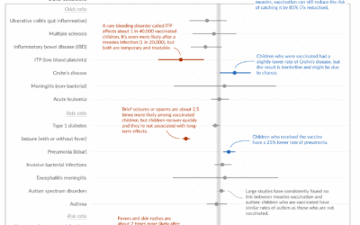
Measles vaccine effectiveness
Despite what some say, the measles vaccine saves lives and is not associated…
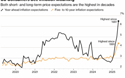
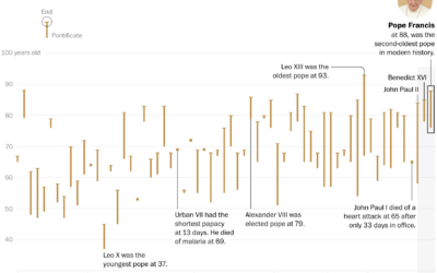
Charts for Trump’s first 100 days
News outlets tend to highlight the first 100 days of a new administration,…
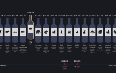
Wine bottles with animals on the label vs. price and quality
You have to pick up a bottle of wine but don’t know what…
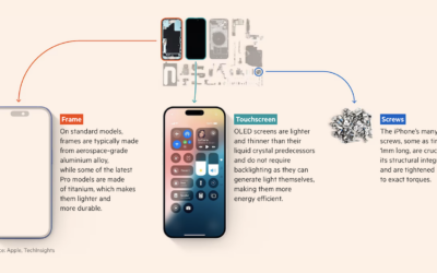
Deconstructed iPhone to show where the parts are manufactured
iPhone parts are manufactured and assembled by different countries, which makes it tricky…
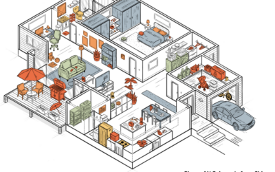
American floor plan from China
Many household items in the United States are almost entirely from China, making…
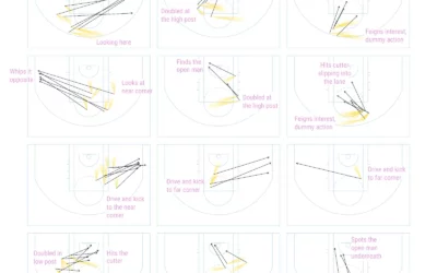
Charting no-look passes by Nikola Jokic
Nikola Jokic of the Denver Nuggets has been showing up in highlight reels…
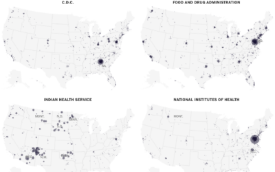
Maps of where federal employees work
When you think about people who work for the U.S. federal government, you…
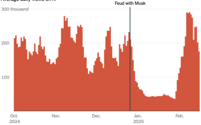
Users’ engagement declined on X after they argued with Musk
This will shock many. There are influencers on X who had high engagement…
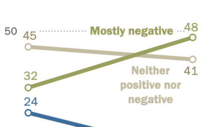
Teens noting negative effects on people their age
Pew Research, in their ongoing surveys on teens and social media usage, highlight…
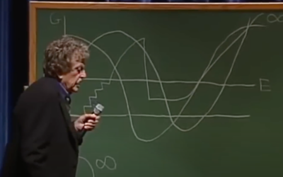
Kurt Vonnegut, Shape of Stories illustrated with charts
New to me, a couple decades ago, author Kurt Vonnegut delivered a lecture…
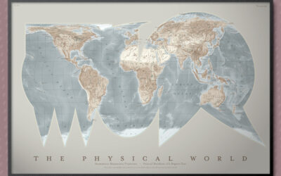
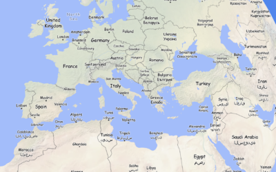
Asymmetric Monstrosity map projection
Part amusement and part learning exercise, the “asymmetric monstrosity” by Daniel Huffman is…
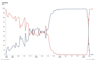
Sharp flip in probabilities of parties winning Canada election
Since early 2024, polls showed near certainty that Conservatives in Canada were going…