Interactive: How Americans Get to Work
The way that people get around can say a lot about how a place is made up.
In the city I grew up, most people drive to where they need to go in under 15 minutes. Medium population, most work in town, and eating out meant somewhere local.
Then I went to college in Berkeley, and it was more common to ride the bus or the BART — and I’m sure being surrounded by poor college students who didn’t own cars had nothing to do with that.
Then it was off to Los Angeles where it’s either drive or take horribly inefficient public transportation. Lots of highways and spread out pockets of residential and business.
In New York, it was all about the subway and occasional taxi. Plenty of things within walking distance.
As for the midwest, sorry I don’t know you very well, but maybe one day. I’ll have to settle for a view through data for now.
With estimates from the United States Census Bureau’s 2013 American Community Survey, we gain a little bit of an idea of what it’s like across the country. The map above shows county-level data on how people get to work.
You can look at one mode of transportation at a time, or you can compare multiple ones to see which is most common in your county.
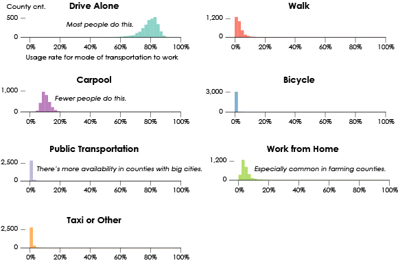
Distributions for the mode of transportation rates at the county level
Of course the leading method is to drive alone, shown in aqua green above. A large majority of counties fall in the 80-percent range. So if you map driving alone against any other modes, the map is dominated by one color.
However, there are a few exceptions. For example, when you compare the four motor vehicle modes, you quickly spot a handful of areas where driving alone is not the leading way to get to work.
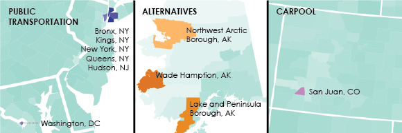
As you might expect, a lot of people take public transportation to work in the New York City area, along with Washington, D.C. In New York county, an estimated 58% of workers use public transportation, and in the former, 38%.
In several counties in Alaska, more people use “other” forms of transportation that isn’t a car, van, or truck. I’ll venture a guess that’s it’s something like snow mobile instead.
In San Juan county, Colorado, it looks like carpooling is a bit more common. However, San Juan has a small population and a large margin of error, so it’s tough to say if carpooling really is more common than driving alone. I’m not sure how much I want to trust estimates where the margin of error is almost equal to the rate. Likely an outlier in sampling more than one in reality.
Take driving alone out of the comparison, and the areas where public transportation is most common is more obvious.
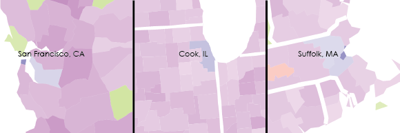
You can also look at public transportation by itself to similar effect, but I think the comparisons make the geography more interesting. For example, you see more people working from home in the midwest, where much of the land is devoted to farming. In many areas, people just walk to work.
It’s also easier to spot the outliers.
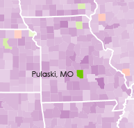 Pulaski county, Missouri is surrounded by a bunch of carpooling, whereas an estimated 35%, plus or minus 1.4 percentage points, of workers “work from home” here. My best bet is that this is from the Army training center Fort Leonard Wood, which trains “80-90,000 military and civilians each year.” For reference, the county’s population is only 52,000 based on the 2010 Census, or about 42% less than those trained.
Let me know if you find any other interesting bits.
Chart Type Used

Become a member. Support an independent site. Get extra visualization goodness.
See What You Get