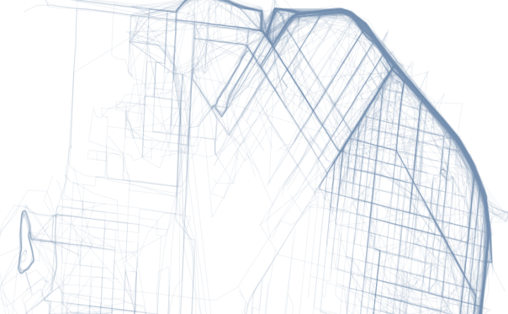
Where People Run in Major Cities

There are many exercise apps that allow you to keep track of your running, riding, and other activities. Record speed, time, elevation, and location from your phone, and millions of people do this, me included. However, when we look at activity logs, whether they be our own, from our friends, or from a public timeline, the activities only appear individually.
What about all together? Not only is it fun to see, but it can be useful to the data collectors to plan future workouts or even city planners who make sure citizens have proper bike lanes and running paths.
Ever since I saw Nikita Barsukov map running traces in a handful of European cities, I wondered what the paths looked like for others. A lot of people make their workouts public on a variety of services, so there’s definitely accessible data. I use RunKeeper for cycling. I sampled from there.
The maps below are what I got, mostly for American cities, but there are a few European cities in there too (alphabetical order). If there’s one quick (and expected) takeaway, it’s that people like to run by the water and in parks, probably to get away from cars and the scenery. In the smaller inland cities, there seem to be a few high-traffic roads with less running elsewhere.
Click to embiggen.


Here’s a R code snippet in case you want to map your own routes. Like I said, I use RunKeeper, which lets you download all of your workouts in one click, as GPX files. Strava, mainly for cycling, also lets you do this. I’m wary of other apps that don’t let you download your traces without paying a premium.
Download your logs from whatever service you use, stick the R code in the same directory, run in the console, and you get a quick plot of your routes.
Update: I should point out that these maps were experimental and certainly don’t show running coverage for all the cities. For example, if you look at the New York map, you’ll notice that there are few running routes in Central Park, which doesn’t make much sense. This has to do with how I fetched data and how RunKeeper encodes it. When you look up routes on RunKeeper for a specific city, you don’t always get routes for the entire city. For example, a New York search yields runs mostly in lower Manhattan.
You might also have noticed noise in the data. Sometimes it looks like people can run over water. Although that would be awesome, this is likely due to blips in data collection. Location is after all via the phone, which isn’t exactly 100% reliable.
So don’t take these maps too literally. They simply cover the tip of a very interesting iceberg.
How to Map Geographic Paths in R
Want to map your own paths? Here’s a tutorial for that.
Chart Type Used

Become a member. Support an independent site. Get extra visualization goodness.
See What You Get