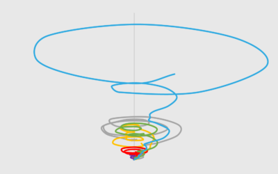
It looks like a tornado. It’s messy. It’s circular. It almost looks intentionally confusing. But how bad is it really?
novelty
-
Members Only
Tornado Lines – Useful or Not? (The Process 088)
-
Members Only
Moratorium On Bar Chart Races; When Impractical Visualization is More Practical (The Process #68)
The dataisbeautiful subreddit announced a moratorium on the ever popular bar chart race. The frequency of submissions that used the method got out of hand and spam made it all the less savory. Still, the method holds value.


 Visualize This: The FlowingData Guide to Design, Visualization, and Statistics (2nd Edition)


