This is quite a visual story from Reuters. In a comic format, they…
illustration
-
Visual story about getting scammed into scamming
-
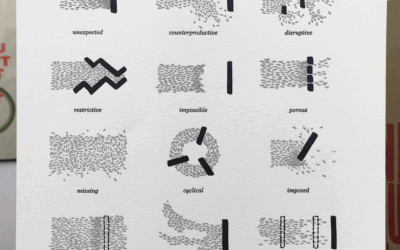
Types of deadlines illustrated from beginning to end
Some deadlines come unexpected, some come staggered, and some come on a fixed…
-
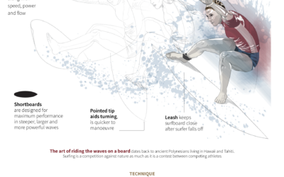
Illustrated guides to Olympic sports
Reuters, with illustrations by Catherine Tai, has visual guides to all of the…
-
Members Only
Visual Metaphor
Welcome to The Process, the newsletter for FlowingData members that looks closer at…
-
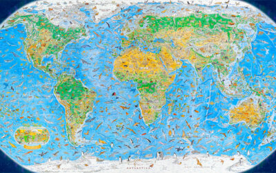
World map of illustrated animals
During a three-year span, Anton Thomas illustrated a world map of 1,642 animals…
-
Toddlers and stochastic parrots
For The New Yorker, Angie Wang draws parallels between toddler learning behavior and…
-
Turn a static SVG into an interactive one, with Flourish
It’s straightforward to share a static SVG online, but maybe you want tooltips…
-
Outsourced work and generative AI
For Rest of World, Andrew Deck turned the AI focus on outsourced workers,…
-
Mona Chalabi wins Pulitzer for data illustrations
Mona Chalabi, known around these parts for her illustrative approach to data journalism,…
-
Spy balloons and UFOs
For The New York Times, Eleanor Lutz illustrated things in the sky, because…
-
Members Only
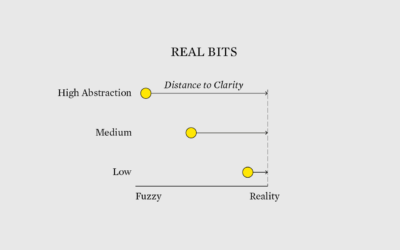
Real Bits
Tie in the real bits among the abstract shapes, colors, and geometries of charts to make the latter easier to understand.
-
Search and rescue after an earthquake, illustrated
After a big earthquake, such as the 7.8 that hit Turkey and Syria,…
-
Inferring the scale of China’s Covid spike through obituaries
China reported 80,000 Covid deaths since lifting restrictions in early December 2022. But…
-
All the parts of daily life in India controlled by Mukesh Ambani
Mukesh Ambani has an estimated net worth of $90.7 billion, because his company…
-
Daylight saving time and circadian rhythms
Daylight saving time ends in the United States this weekend and ended already…
-
What hearing loss sounds (and looks) like
Using an audiogram as a backdrop, Amanda Morris and Aaron Steckelberg, for The…
-
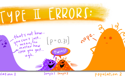
Educational statistics illustrations
Allison Horst often illustrates data science concepts and tools with anthropomorphized shapes and…
-
Coffee versus tea in charts
Anahad O’Connor, Aaron Steckelberg and Garland Potts, for The Washington Post, made charts…
-
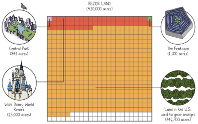
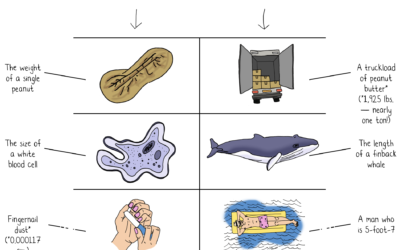
Jeff Bezos wealth to scale
Jeff Bezos’ wealth is difficult to understand conceptually, because the scale is just…
-
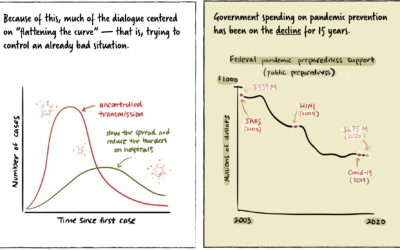
Stopping a pandemic before it starts
For Politico, Beatrice Jin provides an illustrated guide on stopping a pandemic before…













 Visualize This: The FlowingData Guide to Design, Visualization, and Statistics (2nd Edition)


