• In an article for Significance Magazine, economists Barry Reilly, Neil Rickman and Robert Witt explain why robbing banks stinks as a profession.

    The return on an average bank robbery is, frankly, rubbish. It is not unimaginable wealth. It is a very modest £12 706.60 per person per raid. Indeed, it is so low that it is not worth the banks’ while to spend as little as £4500 per cashier position at every branch on rising screens to deter them.

    A single bank raid, even a successful one, is not going to keep our would-be robber in a life of luxury. It is not going to keep him long in a life of any kind. Given that the average UK wage for those in full-time employment is around £26 000, it will give him a modest lifestyle for no more than 6 months. If he decides to make a career of it, and robs two banks a year to make a sub-average income, his chances of eventually getting caught will increase: at 0.8 probability per raid, after three raids or a year and a half his odds of remaining at large are 0.8×0.8×0.8=0.512; after four raids he is more likely than not to be inside. As a profitable occupation, bank robbery leaves a lot to be desired.

    Be sure to read the full article for more details on the varying gains and losses when the team is bigger and whether or not a gun is used. Spoiler: an additional member to the robbing team raises the expected haul by about £9,000, and the use of a firearm raises the expected output by about £10,000. Just don’t get arrested.

    [via Ars Technica]

  • Dave Delisle mapped the Toronto TTC Subway in the style of Super Mario Bros. 3. Adorn your walls with the print. [via Boing Boing]

  • The newest episode of This American Life is on the game of Blackjack. Years ago one summer, I was a recent college graduate with a degree in engineering and a minor in statistics, making seven bucks and some change an hour and waiting for grad school to start. My idle mind grew obsessed with card counting. It didn’t work out so well, but needless to say I found this episode fascinating.

  • Matthew Cusick uses maps as his brush and palette in a series of portraits and landscapes. Pretty.

  • 3-D pie charts are never a good idea? Ha. You just got served.…

  • MIT Technology Review profiles the Facebook Data Science Team, described as a gathering of grad students at a top school and headed by Cameron Marlow, the “young professor.”

    Back at Facebook, Marlow isn’t the one who makes decisions about what the company charges for, even if his work will shape them. Whatever happens, he says, the primary goal of his team is to support the well-being of the people who provide Facebook with their data, using it to make the service smarter. Along the way, he says, he and his colleagues will advance humanity’s understanding of itself. That echoes Zuckerberg’s often doubted but seemingly genuine belief that Facebook’s job is to improve how the world communicates. Just don’t ask yet exactly what that will entail. “It’s hard to predict where we’ll go, because we’re at the very early stages of this science,” says ­Marlow. “The number of potential things that we could ask of Facebook’s data is enormous.”

  • In Newcastle, there’s a floating tide mill building on the River Tyne. The mill turns to generate power for the building, and in that flow of water are four sensors for oxygen, acidity, nitrates and salinity. Values for these metrics, along with wheel speed, are captured about every thirty minutes. Stephan Thiel of Studio NAND, in collaboration with Moritz Stefaner, visualized this data in an abstracted simulation of the flow through the tidemill.

    Particles are continuously moving from right to left, being attracted or repelled by four circular zones representing the sensor values. The overall behavior of the particles is influenced by the turning speed of the waterwheel. If the value of one sensor is above its mean value, particles are repelled. If the value is below the mean, particles are attracted towards the center of the zone.

    For example, if all four values are greater than the mean, you end up with four circular swells around these zones. In the above, oxygen is below the mean, so the simulated flows head towards the center of the oxygen zone instead of move around it like with the three zones before. So you end up with a sort of fingerprint for each window of data capture.

    The data itself is probably of little interest to anyone who doesn’t work at the mill, but the aesthetics of the piece is calming and certainly evokes the context of what the data represents.

    The wind map by Wattenberg and Viegas and Drawing Water by Wicks come to mind. Oh, and also perpetual ocean.

  • We’ve seen a number of looks at movie poster cliches, but this is the first time I’ve seen how the color of movie posters have changed over time. Vijay Pandurangan downloaded 35,000 poster thumbnails from a movie site, counted the color pixels in each image, and then grouped them by year and sorted by hue.

    Some thoughts from Pandurangan’s designer friend Cheryle Cranbourne:

    The movies whose posters I analysed “cover a good range of genres. Perhaps the colors say less about how movie posters’ colors as a whole and color trends, than they do about how genres of movies have evolved. For example, there are more action/thriller/sci-fi [films] than there were 50-70 years ago, which might have something to do with the increase in darker, more ‘masculine’ shades.”

    There’s no mention of the blanked out 1924. That must’ve been a sad year. Oh wait, there were movies during that year, so there was either a massive ink shortage or it’s just missing data.

    [via @DataPointed]

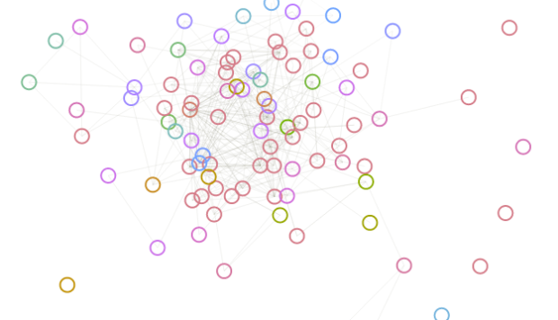
  • Developer Santiago Ortiz explores visualization references through Delicious tags and puts them in a discovery context. There are two views. The first is a network with tags and resources as nodes. At first it looks like a giant hairball, but mouseover and you get a fisheye effect to zoom in on nodes, which makes them more readable. Mouse over a tag, and the labels for related resources get bigger, and likewise, mouse over a resource, and the related tags get bigger.
    Read More