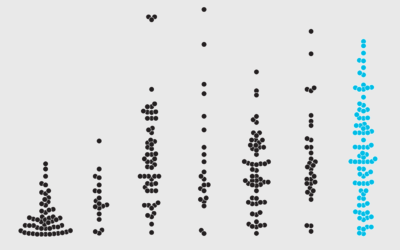
Beeswarm
It emphasizes individual points in a distribution instead of binning them like a histogram.

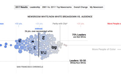
Statistical diversity in US newsrooms
If a news organization wants to talk about the world in a fair…
How I Made That: Interactive Beeswarm Chart to Compare Distributions
The histogram is my favorite chart type, but it's unintuitive for many. So I've been using the less accurate but less abstract beeswarm.
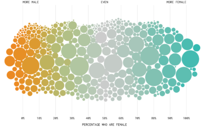

Divorce and Occupation, in 2015
Some jobs tend towards higher divorce rates. Some towards lower. Salary also probably plays a role.
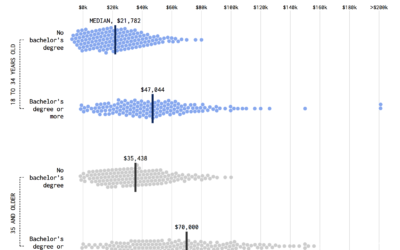
Shifting Incomes for Young People
Compare incomes for young people from the Millennial generation and the baby boomer generation.
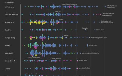
Fast Food Menu of Calories
How does the distribution of calories vary by fast food restaurant? Here's a chart that shows all the menu items for ten of the biggest national fast food chains.
How to Make Beeswarm Plots in R to Show Distributions
Try the more element-based approach instead of your traditional histogram or boxplot.

Shifting Incomes for American Jobs
For various occupations, the difference between the person who makes the most and the one who makes the least can be significant.