Visualization
Showing the stories in data through statistics, design, aesthetics, and code.
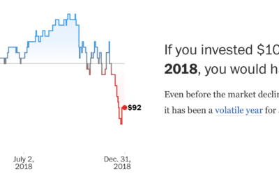
Context to the stock market rise and falls
The stock market is in a state. So finicky the past few months.…
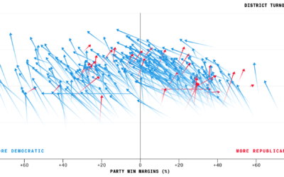
Higher turnout for midterm elections
Bloomberg charted voter turnout for the just past midterm elections, comparing 2018 against…

Best Data Visualization Projects of 2018
Visualization continues to mature and develop into a medium. There's less focus on visualization the tool and more focus on how to use the tools. That is a good thing.
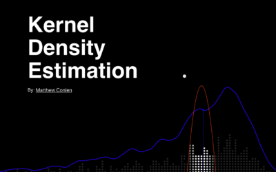
Kernel density estimation explainer
Matthew Conlen provides a short explainer of how kernel density estimation works. Nifty.…
Finding all of the trees in the world with machine learning
Descartes Labs used machine learning to identify all of the trees in the…
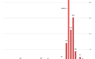
Old Christmas songs get all the play time
Jon Keegan scraped the playlist from the local radio station’s all-Christmas playlist for…
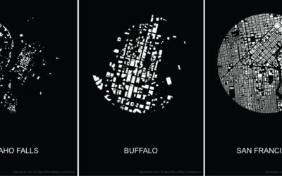
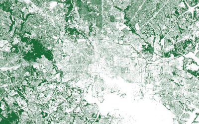
Make a figure-ground diagram using OpenStreetMap data
In visual perception, a figure-ground grouping is where you recognize an object through…
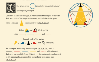
Modern reproduction of 1847 geometry books
Euclid’s Elements is a series of 13 books produced in 300 BC that…
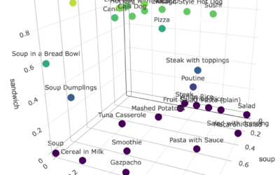
Soup-Salad-Sandwich space
The debate rages on about the categorization of food items as soup, salad,…
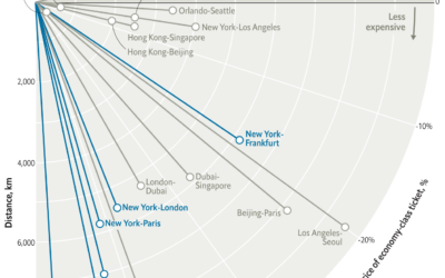
Falling ticket prices for longer flights
Based on data from Expedia, this is an interesting one from The Economist.…
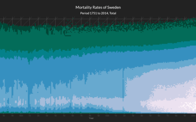
Heatmap shows deaths by age in different countries
This interactive heatmap by Jonas Schöley shows mortality rates by age. Just use…

Same facts but different stories, an illustration
Multiple people can look at the same dataset and come out the other…
Defining visualization literacy
Michael Correll on the use of “visualization literacy” in research:
If people (and,…
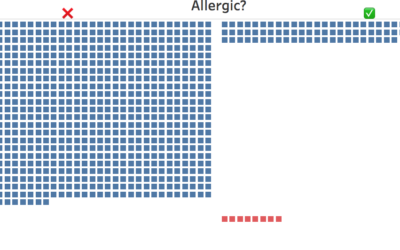
Teaching kids data visualization
Jonathan Schwabish gave his fourth-grade son’s class a lesson on data visualization. He…

Skewed mental map of the world’s geography
The maps that we imagine as we think about locations around the world…
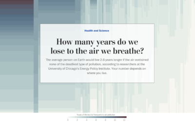
Years of life lost due to breathing bad air
Researchers at the University of Chicago’s Energy Policy Institute estimated the number of…