Visualization
Showing the stories in data through statistics, design, aesthetics, and code.
Map shows you where a raindrop ends up
River Runner is a fun interactive map by Sam Learner. Click anywhere in…
Hospitalization rates for the unvaccinated
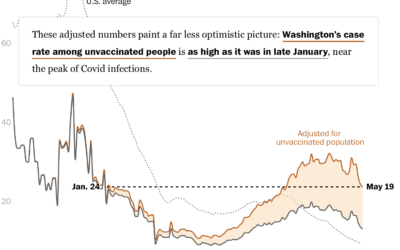
Overall, Covid-19 cases and hospitalizations are down in the United States, but much…
Four types of people who prevent full vaccination
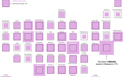
The United States vaccination rate was rolling for a while there, but it…
How perception can save lives
Visualization and perception researcher Lace Padilla was on the kid-centric show Mission Unstoppale…
Most common professional marriages
Susie Neilson for the San Francisco Chronicle compared the marriage of professions in…
Watercolor Maptiles by Stamen are now part of the Smithsonian’s permanent collection
In 2012, Stamen Design released watercolor map tiles based on OpenStreetMap data. It…
Coping with the big numbers
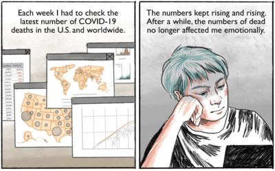
Connie Jin, who works for NPR and updates a Covid-19 dashboard, talks about…
Transform an image into a pixel-ly visual
Here’s a fun interactive by Duc-Quang Nguyen. Upload an image and get back…
Historical shifts in where people live
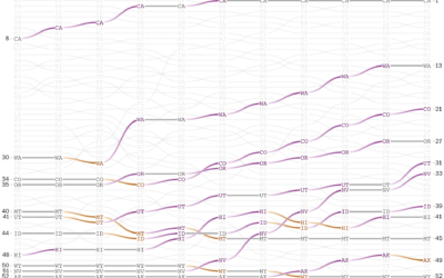
The places in the United States with the highest populations weren’t always like…
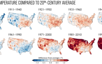
Climate normals mapped over time
Every decade the National Oceanic and Atmospheric Administration releases climate normals to provide…
Map of people moving during pandemic
It was only a matter of time before someone showed dots moving across…
Information Graphic Visionaries, a book series
The Information Graphic Visionaries book series just launched on Kickstarter. Emma Willard, Florence…
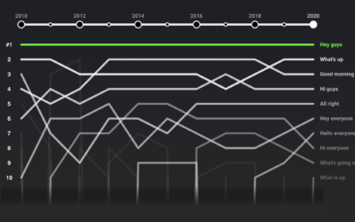
Rankings for YouTube video greetings
If you’ve watched even just a few videos on YouTube, you probably noticed…
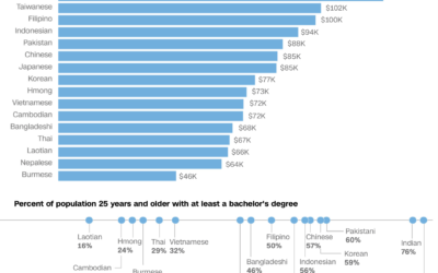
Varying demographics within the Asian American population
We often hear about the Asian American community as one big group of…
All the art in the Oval Office
The President of the United States chooses the art for the Oval Office,…
Bird song sonographs show distinct drawing patterns
These sonographs of bird song, in contrast to the sounds from traditional instruments,…
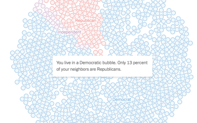
See if you live in a political bubble
Gus Wezerek, Ryan D. Enos, and Jacob Brown for NYT Opinion use neighborhood-level…
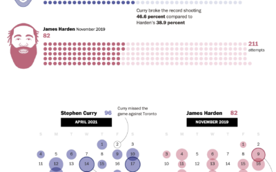
Stephen Curry’s record-setting month for shooting threes
Steph Curry has been on a tear as of late. In April he…

