Visualization
Showing the stories in data through statistics, design, aesthetics, and code.
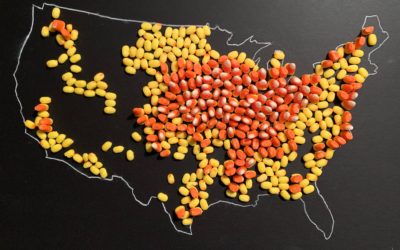
Map made of candy corn to show corn production
With candy corn as her medium, Jill Hubley mapped corn production in the…
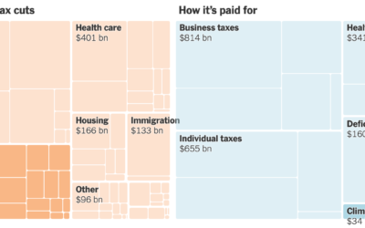
All the provisions in the Build Back Better bill
For NYT’s The Upshot, Alicia Parlapiano and Quoctrung Bui outlined all of the…
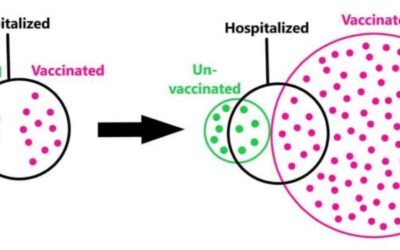
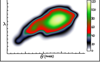
Euler diagram to illustrate base rate fallacy
Some people point out that vaccinated people are still hospitalized as a defense…
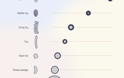
3-D modeling the french fry universe
What is the best french fry shape? Curly of course. But Chris Williams…
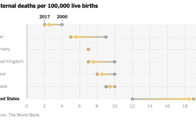
Increased maternal death in the United States
While still relatively rare, maternal mortality in the United States increased over the…
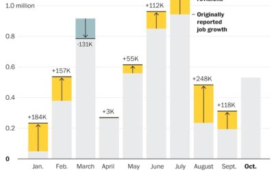
Job growth was underestimated
Andrew Van Dam for The Washington Post used a bar chart with corrections…
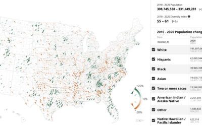
Census Mapper, a tool to visualize population and racial shifts
Pitch Interactive and the Census 2020 Data Co-op, supported by the Google News…
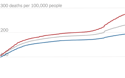
Partisan gap in Covid death counts
David Leonhardt for The New York Times looked at the partisan gap for…
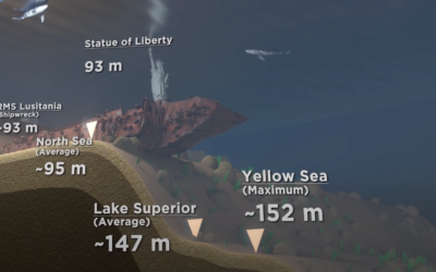
Scale of ocean depths
[arve url=”https://www.youtube.com/watch?v=Q5C7sqVe2Vg” loop=”no” muted=”no” /]
We know the oceans are deep, but it’s…
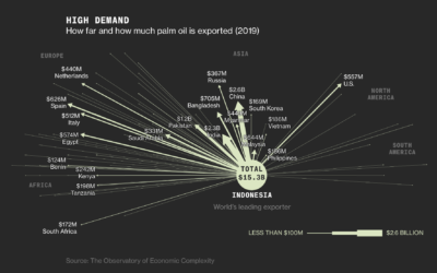
Palm oils and rainforest destruction
Palm oil is in our food, cosmetics, cleaning supplies, and biofuels, but it…
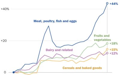
Rising prices of everything
Using Consumer Price Index, Alyssa Fowers and Rachel Siegel for The Washington Post…

Sonified animation of London Covid-19 rates
[arve url=”https://vimeo.com/571217327″ loop=”no” muted=”no” /]
Valentina D’Efilippo, Arpad Ray, and Duncan Geere visualized…
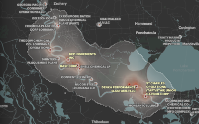
Where cancer risk is greater due to air pollution
Based on five years of data from EPA models, ProPublica mapped areas in…
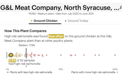
Check the frequency of salmonella in your chicken
The USDA recommends that you cook your chicken to at least 165°F to…