Visualization
Showing the stories in data through statistics, design, aesthetics, and code.
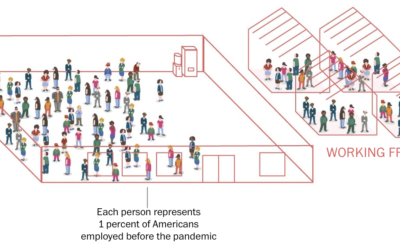
Percentage breakdowns of pandemic life
To broadly show how people have lived in the U.S. during these past…
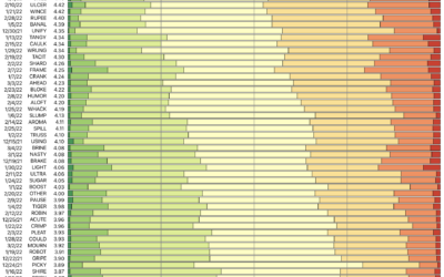
Wordle analysis through the lens of 15m tweets
I don’t know if you’ve heard of it, but there’s this game called…
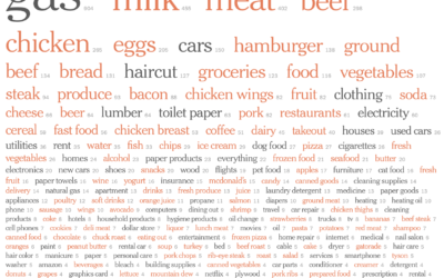
Price increases people have noticed
Inflation is high. For NYT’s The Upshot, Emily Badger, Aatish Bhatia and Quoctrung…
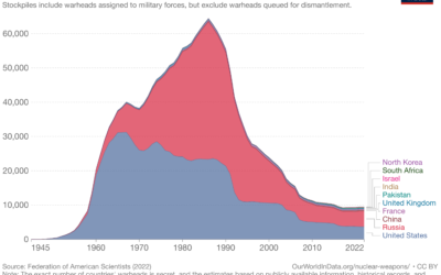
Reducing the risk of nuclear war
For Our World in Data, Max Roser discusses the risk and possible destruction…
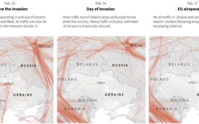
Empty Ukrainian airspace
As you would imagine, Ukrainian airspace looks empty right now. Reuters mapped flights…
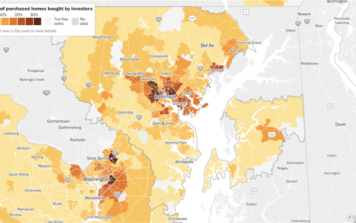
Investors bought up a lot of houses in 2021
Home prices in the U.S. increased dramatically over the past couple of years.…
Unregulated location data industry
For The Markup, continuing their reports on data privacy, Alfred Ng and Jon…
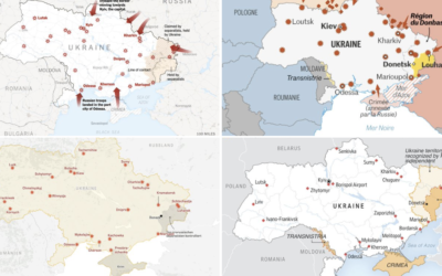
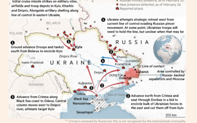
Why Russia is invading Ukraine, a visual guide
RealLifeLore explains the history between the two countries and the multi-faceted motivations behind…
Tracking the sanctions against Russia
Correctiv is tracking sanctions against Russian individuals and companies, based on data from…
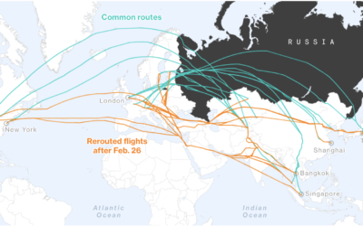
Rerouted flights to avoid Russian airspace
Many countries have banned Russian aircraft from entering their airspace. Russian in turn…
Stat-driven view on how American conservatives shifted against vaccine
As we know by now, conservatives in the U.S. are more commonly against…
Fashion industry’s environmental impact
For Bloomberg, Rachael Dottle and Jackie Gu look at the current state of…
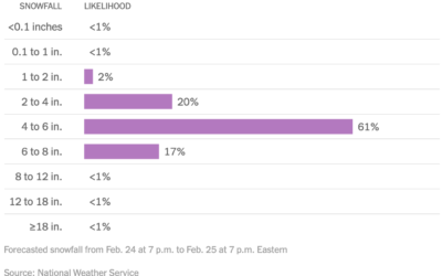
Distribution of snowfall estimates to show uncertainty
For NYT’s The Upshot, Aatish Bhatia, Josh Katz and Margot Sanger-Katz show the…
More readable writing illustrated with more readable writing
For The Pudding, Rebecca Monteleone and Jamie Brew (with design and code by…
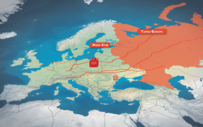
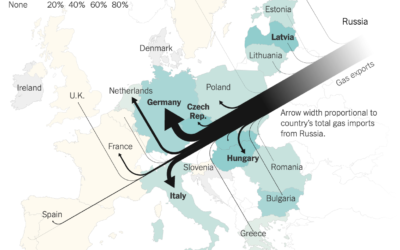
Map of Russian gas exports
Speaking of Russian gas, Josh Holder, Karl Russell and Stanley Reed for The…

