Visualization
Showing the stories in data through statistics, design, aesthetics, and code.
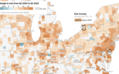
How much rent increased where you live
Rent increased pretty much everywhere in the United States over the past year.…
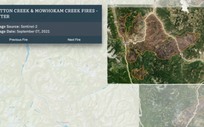
Wildfires and floods, a geographic before and after
In 2021, a large portion of North America was stuck in a heat…
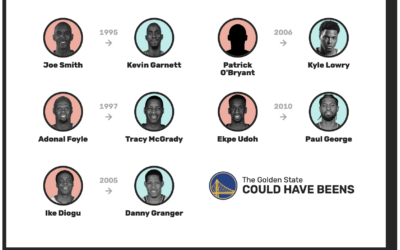
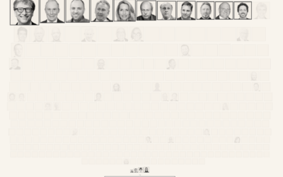
Redrafting the NBA, based on past player performance
With the NBA playoffs underway, it can be fun to watch the best…

Tonga shockwave around the world
Earlier this year, an underwater volcano erupted in the island nation of Tonga.…
Comparing rich people incomes and the taxes they pay
Based on leaked IRS data for the 400 wealthiest Americans, ProPublica provides a…
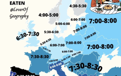
When people eat dinner in Europe
This map by @loverofgeography shows the usual dinner times for countries in Europe.…

Jeff Bezos wealth to scale
Jeff Bezos’ wealth is difficult to understand conceptually, because the scale is just…
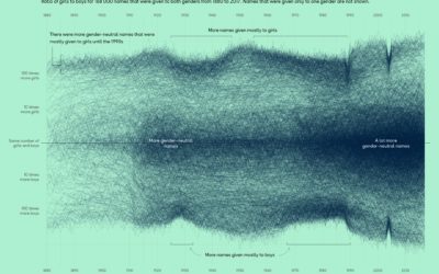
More gender-neutral names
Georgios Karamanis plotted the ratio of girls-to-boys over time for all the names…
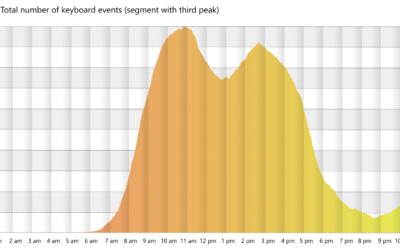
Working the triple peak
Microsoft researchers analyzed keystrokes by time of day, for a sample of Microsoft…
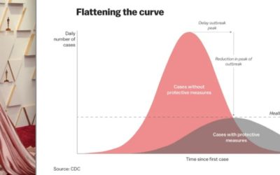
Oscar outfits as public health graphs
The 2022 Oscars came and went, and it was like all anyone could…
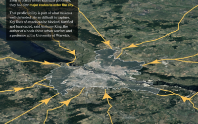
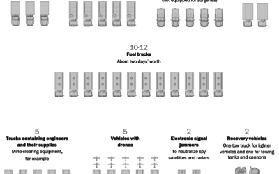
Russia’s logistics problems
For The Washington Post, Bonnie Berkowitz and Artur Galocha report on several facets…
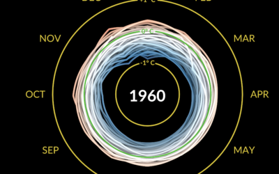
Climate spiral to show temperature change
Say what you will about circular visualization, but the spiral plays. This one…
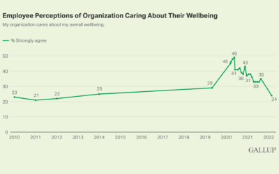
Most people think their employers don’t care about their well-being
Based on polls by Gallup, almost half of U.S. employees thought their employers…
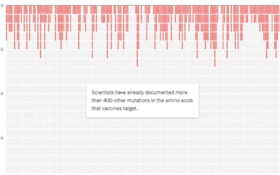
Potential coronavirus mutations
For NYT Opinion, researchers Sarah Cobey, Jesse Bloom, and Tyler Starr, along with…
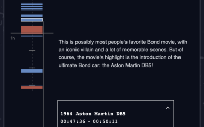
Charting all the vehicles of James Bond
Baryon Design collated data for all the vehicles James Bond used across all…