Visualization
Showing the stories in data through statistics, design, aesthetics, and code.
Explorable explanation for matrix transformations
Instead of using a bunch of equations to memorize, Yi Zhe Ang visually…
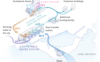
Using cold lake water to cool buildings
There are buildings in Toronto, Canada that make use of a deep lake…
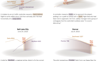
Passenger planes flying too close
Sometimes passenger planes get a little too close to each other on takeoff…
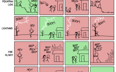
xkcd: Pairwise matrix of what to do in an emergency
xkcd has an informative reference for what do in case of mountain lion…
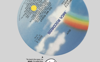
Visual breakdowns of iconic hip-hop samples
Hip-hop music producers often sample from previous works. They remake, restructure, and repurpose…
Hip-hop’s influence on the English language
For The New York Times, Miles Marshall Lewis highlights the etymology of five…
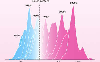
Shifting towards more hot days, fewer cold days
It keeps getting hotter around the world. Not every single day. But over…
Cultural Midwest, not technically
The U.S. Census Bureau defines the Midwest as the region of twelve states…
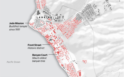
Map of Lahaina buildings destroyed in wildfire
Most of the Maui town Lahaina was destroyed by wildfire. The Wall Street…
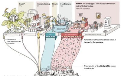
Greenhouse gas from wasting food at home
Almost half of wasted food comes from homes, and almost half of that…
Rarity of songwriters who are women for popular songs
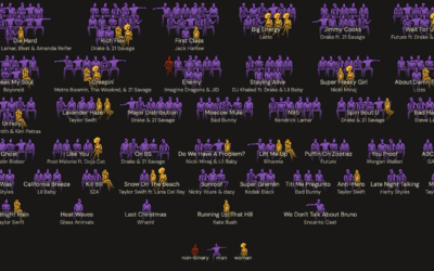
It’s common to see singers who are women, but the people who write…
Taylor Swift pop charts
Taylor Swift has been filling up stadiums across the United States and will…
Hot surfaces, stored energy
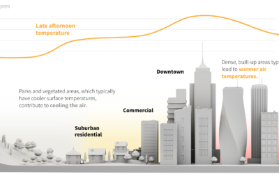
In hot places, the ground can heat to higher temperatures than the air,…
Comparing home run in distance different stadiums
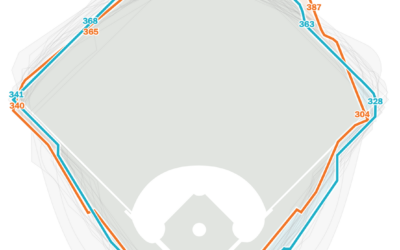
In Major League Baseball, a player hits a home run when the ball…
Racing amateurs against Tour de France cyclists
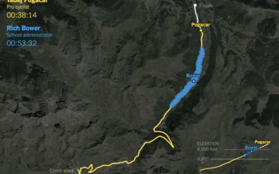
It takes strength and dedication to race in the Tour de France. It’s…
John Snow’s cholera map, an animated version
Sarah Bell made an animated version of John Snow’s classic map from 1854.…
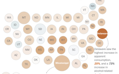
Increasing alcohol-related deaths
Alcohol consumption, based on ethanol volume estimates, has been rising over the past…


