Visualization
Showing the stories in data through statistics, design, aesthetics, and code.
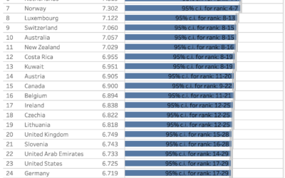
Happiness ratings, by country and age
The World Happiness Report, published each year since 2012, just dropped for 2024.…
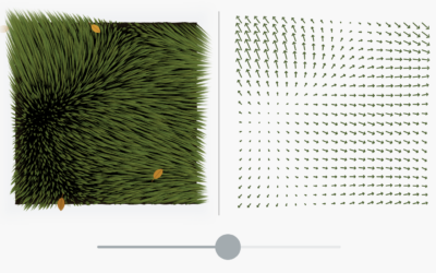
Birding and data visualization
Jer Thorp has combined birding and data visualization into a unique course called…
Visual guide to airfoils
Bartosz Ciechanowski is at it again with an in-depth explainer that makes heavy…
Mile-by-mile map along the path of totality
On April 8, 2024, the moon is going to completely block the sun…
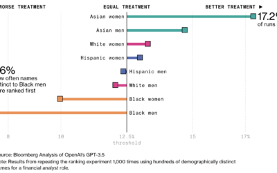
Racial bias in OpenAI GPT resume rankings
AI is finding its way into the HR workflow to sift through resumes.…
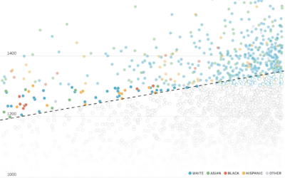
Diversity in college admissions without considering race
For NYT’s The Upshot, Aatish Bhatia and Emily Badger model how colleges might…
Defining the greatest albums of all time
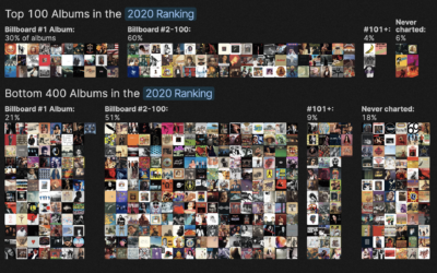
Rolling Stone published a list in 2003 that ranked the 500 greatest albums…
Mapping the crops with the most potential in a changing climate
The climate is changing, which means some crops will fair better or worse…
Analysis of when movies use their own names in the dialogue
A title drop is when a movie mentions its own name during the…
Tiny chip manufacturing, visually explained
Microchips have gotten tiny. Like smaller than a red blood cell tiny. Financial…
If we didn’t have leap years
For CNN, Amy O’Kruk and Kenneth Uzquiano asked what would happen if we…
Rock map of Scotland
Harry Jefferies shared his grandfather’s 30-year project:
My grandpa who is 85 started…
Algorithmic road trip to visit a street named after each day of the year
Ben Ashforth set out to visit a street named after a day of…
Interactive LED basketball court
During the 2024 NBA All-Star weekend, the basketball court was essentially a giant…
Map of most common domesticated animals
Based on data from the USDA Census of Agriculture, this map by John…
Rise of Caitlin Clark, scoring machine
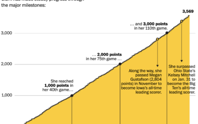
Caitlin Clark, a basketball guard for the University of Iowa, has been steadily…

