Visualization
Showing the stories in data through statistics, design, aesthetics, and code.
The Universe as We Know It
The Known Universe from the American Museum of Natural History shows a view…
Charting the Decade
Did we all see this? Phillip Niemeyer of Double Triple pictures the past…
The Decline of Maritime Empires
This experiment (below) by graduate student Pedro Miguel Cruz shows the decline of…
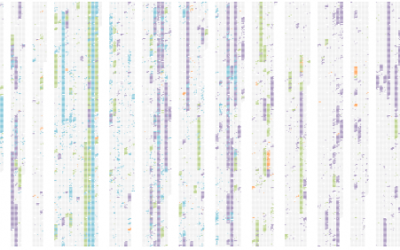
Elastic Lists Celebrates Five Years of Information Aesthetics
In celebration of Information Aesthetics’ birthday, Moritz Stefaner of Well-formed Data adapted his…
Build Statistical Graphics Online With ggplot2
Statisticians are generally behind the times when it comes to online applications. There…
Virtual Slot Machine Teaches the Logic of Loss
This interactive by Las Vegas Sun describes how in the long run, you’re…
Infographic Coins for International Visitors
You know when you go to another country and have no clue what…
5 Best Data Visualization Projects of the Year – 2009
It was a huge year for data. There’s no denying it. Data is…
Canvi & Temps: An Exploration of Science Over Time
Bestiario, the group behind 6pli and a number of other network projects, released…
Twitter Mentionmap and Correlations at your.flowingdata
your.flowingdata got a couple of cool updates recently. One is based on your…
Microsoft Live Labs Pivot: Interact With Massive Amounts of Data
What if you could see all the individual bits of information scattered across…
How to Make an Interactive Area Graph with Flare
You’ve seen the NameExplorer from the Baby Name Wizard by Martin Wattenberg. It’s…
8 Great Gifts for Your Data Geek
The gift-giving season is here, and you’re probably wondering what to get everybody.…
The Geography of AIDS Around the World
It was World AIDS Day last week and UNAIDS published the latest estimates…
Should You Get the H1N1 Vaccine?
David McCandless, author of The Visual MIscellaneum, delves into the usefulness of the…
Stat Charts Get a New York Times Redesign
Statistical graphics are often… kind of bland. But that’s fine, because they’re usually…
A New Way to Search Images With Google Image Swirl
There’s this branch in computer science and statistics for vision research. Normally, if…
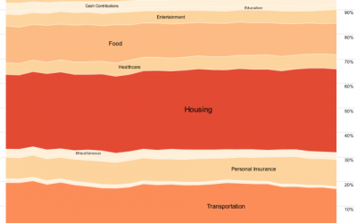
Can You Guess What These Maps Show?
I’m no doubt still under massive food coma at this time, but in…