Visualization
Showing the stories in data through statistics, design, aesthetics, and code.
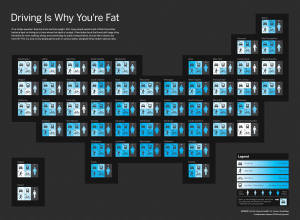
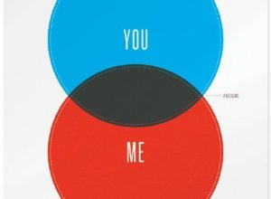
Discuss: Driving is why you’re fat?
In a collaboration between GOOD and Hyperakt, they come out with a bold…
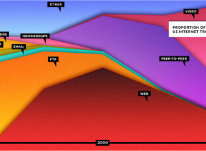
Stacked area shows the Web is dead?
Wired has declared that the Web is dead in their September cover story,…

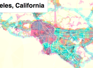
Stamen makes experimental prettymaps
Add another toy to Stamen’s bag of tricks. The recently launched prettymaps by…
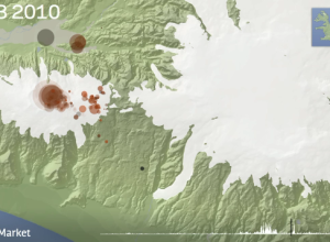
Animated map of earthquakes in Iceland
I’m late on this, but remember that volcano eruption in Iceland a few…
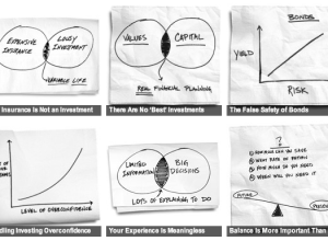
Back-of-the-napkin personal financial advice
Carl Richards, a financial planner and a regular on The New York Times’…

Martin Wattenberg talks data and visualization
Martin Wattenberg, who with his associate Fernanda Viégas, was just snatched up by…
Weeplaces visualizes your FourSquare movements
I’m still not comfortable sharing my location with strangers, and my friends are…

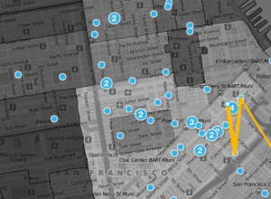
Designing an easier-to-read NYC subway map
There’s a lot of history behind the New York City subway map, but…
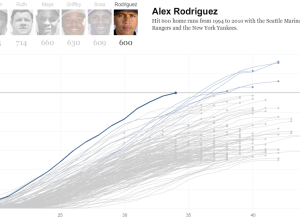
Alex Rodriguez joins the 600 club
Alex Rodriguez became only the seventh player in MLB history to hit 600…
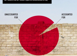
$8.7b Iraq development funds unaccounted for
A simple question from GOOD magazine: where did the money to rebuild Iraq…
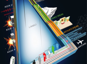
Another view of Inception, with the kicks this time
Here’s another timeline of Inception from deviantArt user, dehas. This one has the…
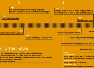
Back to the Future trilogy timelines
You know I can never resist a good Back to the Future reference.…
Need a new logo? Use this flowchart to decide
This flowchart from Watermark Design helps you decide if you need a new…
Browse street-side with Microsoft Street Slide
When street view came out on all the the popular online map applications,…
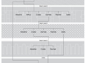
Inception dream levels explained in flowchart
You knew this was coming. I’d call spoiler alert for those who haven’t…
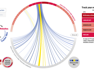
What online marketers know about you
Andrew Garcia Philips and Sarah Slobin (plus five data gatherers) of The Wall…