I’ve always thought of Flickr as a place where I can share my photos with friends and family; however, I’m starting to see there’s a whole lot more than that. It’s a great place to find inspiration for infographics and visualizations or to just browse the giganto collection of work from others.
Here are some awesome data-related Flickr groups that are worth a look.
Info Graphics
“Charts, graphs, facts – anything that is about information or visualising information” [link]

Guardian Datastore
“Take our data, mash it up and create great visualisations with it – then post them on here” [link]

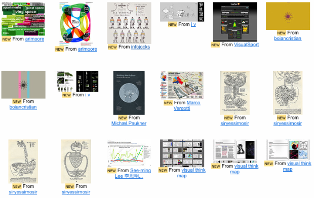
maps and charts
“If you have some interesting Map or Chart images to add to this group please do so… with that being said, not all maps and charts are pretty, and I intend on being pretty hardcore about what sits in the pool…” [link]

WebOps Visualizations
“Lovely, delicious data porn.” [link]

Diagram Diaries
“Diagrams are interesting representations of reality and data.” [link]

Cool Data Visualization Techniques
“Coolness, aesthetics and efficacy of visual representation methods.” [link]

FlowingData
![]() Naturally, I started a group for FlowingData too. Be sure to join and then send your stuff to the FlowingData group pool, especially if you’d like to get your stuff featured here. I’ll be keeping an eye on this one. [link]
Naturally, I started a group for FlowingData too. Be sure to join and then send your stuff to the FlowingData group pool, especially if you’d like to get your stuff featured here. I’ll be keeping an eye on this one. [link]
Do you know of any other worthwhile Flickr groups? Let us know in the comments.
 Visualize This: The FlowingData Guide to Design, Visualization, and Statistics (2nd Edition)
These are great inspiration as you say Nathan. I’ve been showing the ‘visual information’ pool from my blog for sometime. I think the items here are all informative and esthetic.
flickr group:
http://www.flickr.com/groups/visualinformation/pool/
My blog:
http://findingdelta.wordpress.com/
Pingback: Flow » Blog Archive » Daily Digest for November 6th - The zeitgeist daily
Pingback: Moonlit Minds « Moonlit Minds
InfografÃa Cotidiana: Signs, posters, instructions, etc.
http://www.flickr.com/groups/infografia/pool/
Everybody is welcome!
Thanks for sharing. Fun to explore how people visualize concepts.
I’m a fan.
Pingback: 7 Visualization Groups On Flickr to Find Inspiration | FlowingData « Intersectable
I put together a list of good infographic collection posts and galleries that i’m sure will inspire the beginner or expert:
http://visualisationmagazine.com/blogvisualthinkmap/2009/10/100-of-the-best-data-visualisations-infographics.html
Also see “Innovation in Data Visualization”, a group dedicated to excellence in the data viz world. http://www.flickr.com/groups/innovation-dataviz/.
Pingback: links for 2009-11-06 « Ex Orbite
Pingback: links for 2009-11-07 | Glorified Monkey
Pingback: Flow » Blog Archive » Daily Digest for November 7th - The zeitgeist daily
I love Good magazine’s flickr archive of infographics:
http://www.flickr.com/photos/goodmagazine/sets/72157618896371005/
Pingback: Analytics Team » Blog Archive » Visualization groups on Flickr
Pingback: Inspiring Visualization Groups on Flickr | Glorified Monkey
Pingback: Advurt » 7 Visualisation Groups On Flickr
Pingback: 7 Visualization Groups On Flickr to Find Inspiration | VizWorld.com
Pingback: Planner Reads » Blog Archive » 7 Visualization Groups On Flickr to Find Inspiration
Pingback: Planner Reads » Blog Archive » Links for 2009-11-10 [del.icio.us]
Pingback: Box Scores, Nov. 9-15: “Being Connected, Experts & The Future” « Work. Play. Do Good.