Visualization
Showing the stories in data through statistics, design, aesthetics, and code.
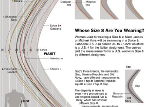
Women’s dress sizes demystified
Women’s clothing sizes have always confused me. My wife always has to try…
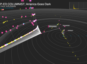
New York Times R&D Lab explores how news is shared and read with Project Cascade
For online publications, it’s useful to know how people share links to articles…
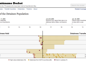
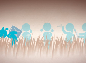
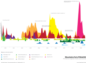
History of detainees at Guantánamo
On January 11, 2002 the first detainees arrived at Guantánamo. On January 22,…
Water changes everything in motion graphics
In the most recent media push for Charity: Water, a video of motion…
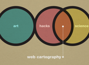
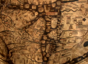
Art, science, and cartography
Similar discussions going on in the cartography branch among UW Madison geography folks.…
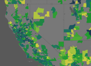
How long it takes for house prices to drop
Shopping for a house? Sometimes it can be advantageous to wait a while,…
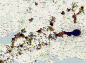
Map your location – that your iPhone secretly records
Researchers Alasdair Allan and Pete Warden have found that the iPhone records cell…
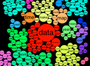
See what you and others tweet about with the Topic Explorer
When you first come across a Twitter account it can be hard to…
Visualization as a mass medium in the 21st century
In an op-ed for CNN and perhaps adding fuel to the fire, Martin…
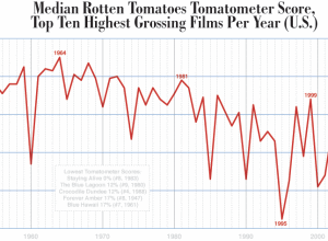
Dropping movie ratings from the past six decades
Dorothy Gambrell of very small array charts median Tomatometer ratings of the top…
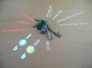
DisplayCabinet augments keys and wallet with data
DisplayCabinet is a clever use of a projected display and RFID tags to…
Business intelligence vs. infotainment
Business intelligence expert Stephen Few goes on another rant about information graphics —…

Mental disorder graphics
Designer Patrick Smith has a minimalist look at mental disorders:
I was doing…
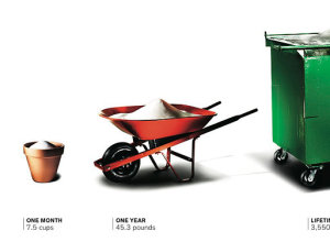
Sugar consumption buckets
Lovely imagery showing sugar consumption for day through lifetime. The average American consumes…
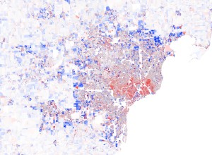
Rings of population change by block
You’ve seen population changes at the state and county level, but with Census…
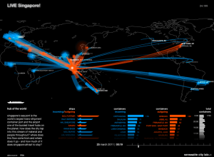
The city in real-time
The MIT SENSEable City Lab presents five different perspectives of the ebb and…
Beauty of Maps available in its entirety
Almost a year ago, the BBC aired the Beauty of Maps, but we…