Visualization
Showing the stories in data through statistics, design, aesthetics, and code.
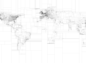
Rectangular subdivisions of the world
Eric Fischer, who continues his string of mapping fun and doesn’t even do…

Musical spectrum analysis
Jon-Kyle Mohr visualizes the musical spectrum of a song in this mesmerizing video.…

Imager shows cross-sections of everyday objects – analog version
GE shows how their body imaging technology can take detailed pictures of insides…
BBC Knowledge
This is totally sunshine and lollipops, but it has a good flow to…

The United Kingdom of McDonald’s
In a follow-up to his ever popular McMap that showed distance to the…
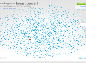
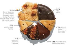
Breast cancer conversations
With Breast Cancer Awareness Month coming up in October, data visualization firm Periscopic…
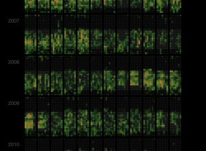
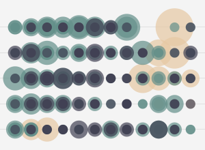
Last.fm scrobbles as calendar heat map
Martin Dittus, a former Last.fm employee, grabbed listening data for staff, moderators, and…
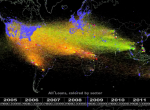
Five years of Kiva lending and borrowing
Kiva, the microfinance site, lets you give small loans to people around the…
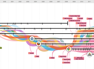
Evolution of the Web
In celebration of Chrome’s third birthday, Google teamed up with Hyperakt and Vizzuality…
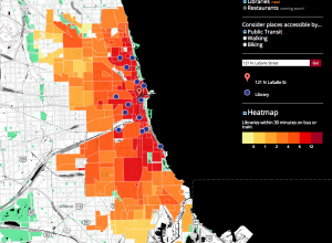
Getting around Chicago in 30 minutes or less
When you’re deciding on a place to live in a new place, it’s…