Visualization
Showing the stories in data through statistics, design, aesthetics, and code.
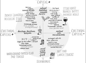
Bourdieu’s Food Space chart, from fast food to French Laundry
In Pierre Bourdieu’s Distinction: A Social Critique of the Judgement of Taste from…
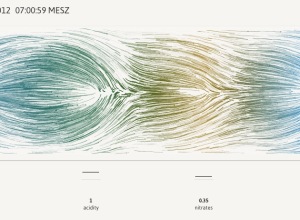
World sentiment mapped, based on Wikipedia
Kalev H. Leetaru animated world sentiment over time, based on Wikipedia entries.
See…
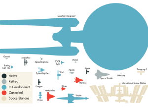
Spaceships drawn to scale
Molecular astrophysicist Invader Xan drew spaceships, real and fictional, to scale.
This, my…
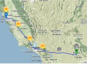
Road trip planner with weather forecasts
Online maps have made it easy to find directions from point A to…
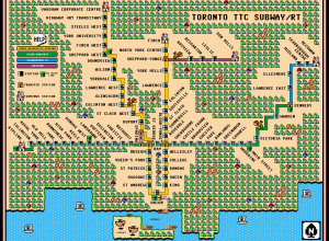
Toronto subway map, Super Mario 3 style
Dave Delisle mapped the Toronto TTC Subway in the style of Super Mario…
Art using inlaid maps
Matthew Cusick uses maps as his brush and palette in a series of…
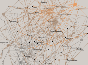
Network of data visualization references
Developer Santiago Ortiz explores visualization references through Delicious tags and puts them in…
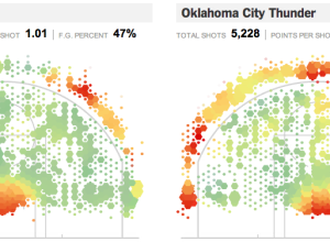
Geography of the basketball court, interactive edition
Remember geographer Kirk Goldsberry’s analysis of shot efficiency on the basketball court? Jeremy…
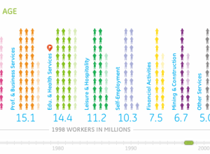
Working in America over the decades
Information visualization firm Periscopic, in collaboration with GE, explores the makeup of the…
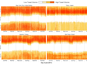
When the world sleeps, based on Twitter activity
Twitter engineers Miguel Rios and Jimmy Lin explored tweet volumes in different cities…
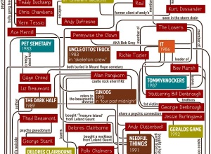
Flowchart: Connections in Stephen King novels
There are various connections between Stephen King novels. Gillian James puts them in…

Fat and calories depicted in food pictures
You would think that fat content and calorie counts would be straightforward by…
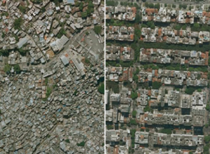
Income inequality seen in satellite images from Google Earth
Researchers Pengyu Zhua and Yaoqi Zhang noted in their 2008 paper that “the…
Overfishing visually explained
As part of their mission to reform destructive fishing practices, Ocean2012 explains the…
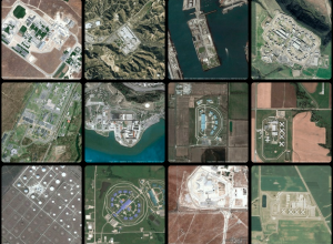
Geography of incarceration
New York University graduate student Josh Begley grabbed 4,916 satellite images of prisons…
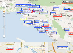
Political allegiance via wireless network SSIDs, mapped
Wireless network SSIDs in residential areas are typically left on default router names…