
Visualization
Showing the stories in data through statistics, design, aesthetics, and code.
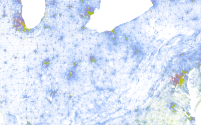
Racial dot map
Dustin Cable, a demographer at the University of Virginia’s Weldon Cooper Center for…
A second on the Internet →
In a straightforward view of online activity, Designly shows the approximate number of…
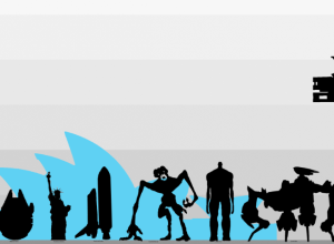
Size comparison of everything
If you’re like me, you often wonder how big the Stay Puft Marshmallow…
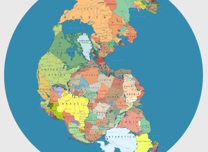
Pangea with political boundaries
What would Pangea look like if today’s political boundaries were drawn on it?…
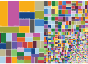
Useless infographics
The Guardian posted a small collection of useless infographics. It kind of looks…
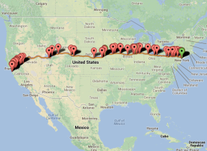
BreweryMap plans your next beer road trip
BreweryMap, a Google Maps mashup and mobile app, provides two main functions. The…
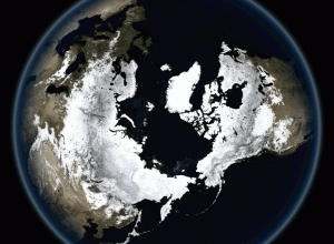
Breathing Earth
John Nelson of IDV Solutions strung together satellite imagery for dramatic animated GIFs.…

A study of quantified emotion
Mike Pelletier experimented with quantified emotion in his piece Parametric Expression. This is…
Internet critique as infographic music video
I’m not entirely sure how to interpret this music video from Franz Ferdinand,…
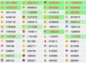
Tracking emoji usage on Twitter
The people I follow on Twitter almost never use emojis, but every now…
NYPL map vectorizer
The NYPL map vectorizer turns old maps into GIS data.…
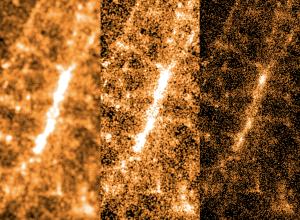
Lessons learned from mapping millions of dots
Erica Fischer, known around these parts for her dot maps, describes the lessons…
Physics of love
Louise Ma, along with Chris Parker and Lola Kalman, started a six-part short…
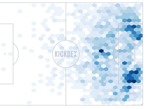
Soccer assists mapped
Using Opta data for assists in the Premier League, Kickdex made this straightforward…
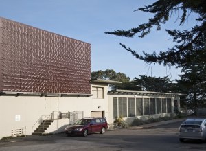
Physical installation shows actual wind patterns
Artist Charles Sowers specializes in public art works and display of physical phenomena.…

GPS shoes show you the way home
Inspired by The Wizard of Oz, where Dorothy clicks her heels to get…
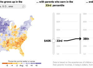
Climbing the income ladder →
In a study conducted by researchers at Harvard and UC Berkeley, data shows…
