Visualization
Showing the stories in data through statistics, design, aesthetics, and code.
Geoguessr
GeoGuessr is a game of location. It plops you somewhere in the world…
Creating a hexagonal cartogram
How to create a hexagonal cartogram using a combination of ArcGIS, Python, and…
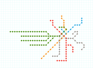
Exploration of how much geography is needed in metro maps
Terrence Fradet of Fathom Information Design ponders whether metro maps suffer or benefit…
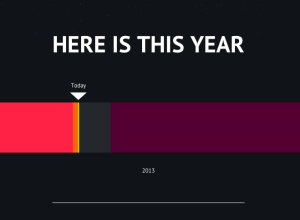
Putting today into perspective
When you focus on all the small events and decisions that happen throughout…
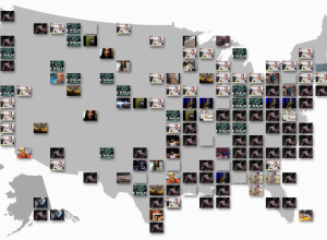
YouTube Trends map shows most popular videos by region
I don’t know about you, but when I go to YouTube, I check…
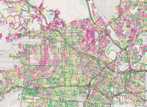
Map shows street quality in Los Angeles →
Nevermind the horrible traffic in Los Angeles, where it takes a several hours…

Color signatures for classic novels
Jaz Parkinson made color signatures for classic novels. Basically, mentions of colors were…
Geographic Bounding Boxes
Geographic Bounding Boxes. A trivial task in a 2-D space, but tricker on…

Glowing landscape shows river history
The poster by Daniel E. Coe shows the life-like historical flows of the…
Fixing bus routes using mobile data
In parts of the world where there are few smartphones and GPS-enabled devices,…
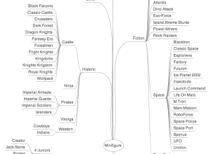
Lego minifigure taxonomy
There are over 4,000 Lego minifigure characters ranging from plumbers and judges to…
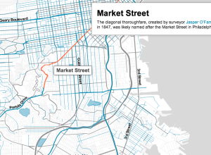
History of San Francisco street names mapped
Where do street names come from? Sometimes there’s actual history behind a name,…
A thorough Facebook analysis by Stephen Wolfram
Stephen Wolfram analyzed the Facebook world, based on anonymized data from the Wolfram|Alpha…

Stop motion video: Food you can buy for $5 in different countries
This stop motion video from BuzzFeed shows how much food you can buy…
Visualization as Process →
Jer Thorp describes visualization as process rather than a tool or a product.…
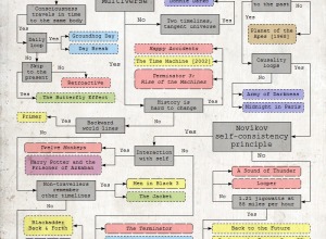
Flowchart for movie time travel →
Mr. Dalliard provides this handy flowchart to organize time travel movies. And yes,…
On Maps with Michal Migurski
Michal Migurski talks online mapping on the Data Stories podcast. Some history and…
Orbiting planets found by NASA Kepler mission
The Kepler mission by NASA has discovered more than 100 planets that orbit…