Visualization
Showing the stories in data through statistics, design, aesthetics, and code.
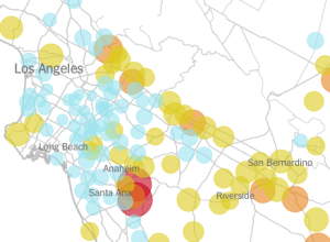
California water use per capita, by district
Matthew Bloch and Haeyoun Park for the New York Times mapped, for about…
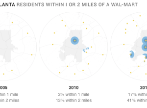
Growth of urban neighborhood Wal-Mart
Maybe you saw the Wal-Mart growth map I made a while back. NPR…
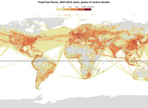
Map of global carbon emissions
Using data from the Earth System Research Laboratory of the National Oceanic and…
Gay marriage legalized by state
Changes in gay marriage rights had changed slowly over the years, but more…
Minimal landscape maps
Designer Michael Pecirno experiments with single-subject maps in his project Minimal Maps. No…
Making better social media maps
Location-based data from social media can be interesting to analyze and map, but…
Gender gaps around the world
Ri Liu provides an exploratory view of gender gaps around the world through…

Future of visualization
Jeffrey Heer, computer science professor and co-founder of Trifacta, describes the future of…
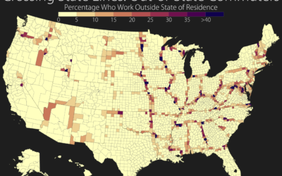
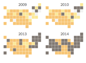
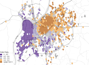
Out-of-state commuters mapped
In a straightforward map, Seth Kadish shows the percentage of county residents who…
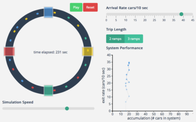
Traffic gridlock simulation
I hate all things commute- and traffic-related, and it’s probably why I like…
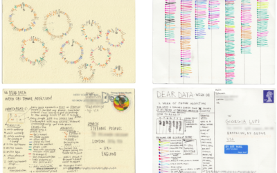
Data drawing pen pals
Stefanie Posavec, known around these parts for her manual data design and Giorgia…
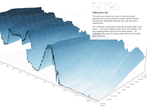
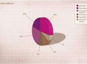
3-D chart for economy’s future
People like to poke fun at 3-D charts, mostly because they don’t work…