Visualization
Showing the stories in data through statistics, design, aesthetics, and code.
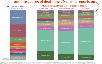
Mortality in the news vs. what we usually die from
Our World in Data compared causes of death in the United States against…
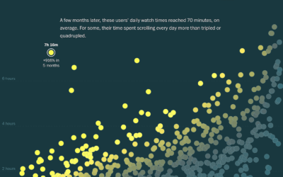
Analysis of TikTok usage, transforming new users to power users
As many of us have learned first-hand, TikTok (and its scrolling video ilk)…
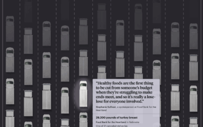
Millions of pounds of canceled food aid in the US
The administration cut $500 million of aid to U.S. food banks earlier this…
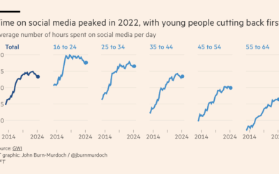
Passed peak social media, maybe
As we descend towards slop-based social media, where the videos are fake and…
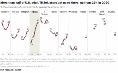
Getting more news from the TikTok
Pew Research surveyed U.S. adults about news consumption on social media and found…
Undelivered USAID medical supplies and medicine
Earlier this year, the administration halted USAID shipments of antimalarial and HIV medical…
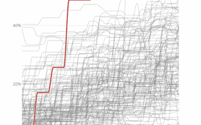
Length of government funding gaps
The government shutdown of 2025 begins. Here is a quick table by Nigel…
Government shutdowns and disagreements in federal funding
As one might expect, Congress is having trouble figuring out how to fund…
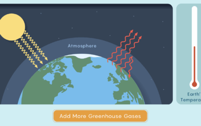
Quantum mechanics of greenhouse gases
For Quanta Magazine, Joseph Howlett and Mark Belan explain the mechanics of how…

Sonification of the everyday through music
You can find rhythms and patterns when you look closely at the activities…
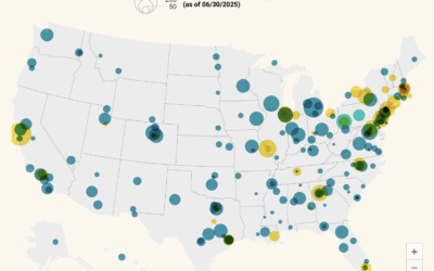
Map of H-1B visa holders at research institutions
Most of the H-1B attention has been on companies, but many visa holders…
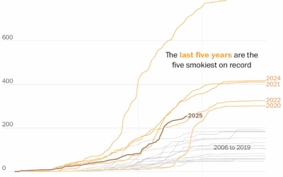
More wildfire smoke, pollution, and days
The wildfires keep coming, and the smoke pollution keeps filling the air. It…
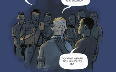
Visual story about getting scammed into scamming
This is quite a visual story from Reuters. In a comic format, they…
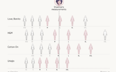
Inconsistent women’s clothing sizes across brands
Women’s clothing sizes aren’t the same across brands. The Straits Times collected measurements,…
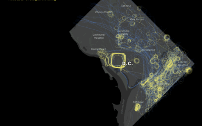
Helicopter paths show circling and hovering in Washington, D.C.
The Washington Post algorithmically identified circling flight paths for helicopters over Washington, D.C.,…
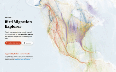
Bird migrations in a map explorer
The Bird Migration Explorer shows bird migrations that you can explore. Each color…

Sorting data, the quiz game
Speaking of data games, Dataguessr by David Bauer is a sorting game that…
Chartle, a daily guessing game with charts
Chartle, by Erwan Rivault and Adnaan Jiwa, is a game to test and/or…