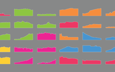
Projects
Graphics by Nathan Yau, borne out of everyday curiosities, learning experiments, and mild insomnia.

Household Types, Then and Now
Here's how common each household type is and was — and how the makeup compares to a few decades ago.
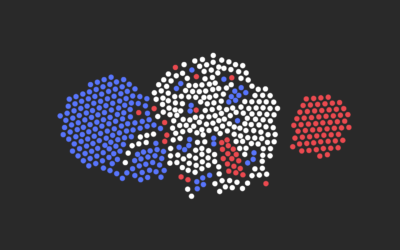
What That Election Probability Means
You're going to see probability values mentioned a lot these next few months. Many people will misinterpret. But not you.
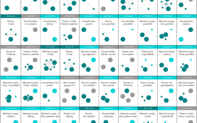
Most Common Family Types in America
Nuclear is still the most common, but there are millions of households in the United States with a different family structure.
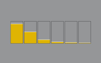
How Much Alcohol Americans Drink, in 2014
Most people have one or two drinks on average, but some consume much more.

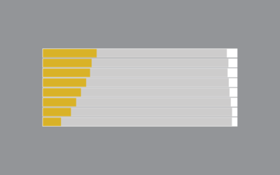
Shifting Incomes for American Jobs
For various occupations, the difference between the person who makes the most and the one who makes the least can be significant.
Who Still Smokes?
Two decades out from the first statewide ban on smoking in enclosed workplaces, here's who still smokes.
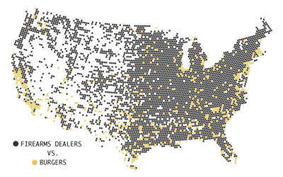
Firearms Dealers vs. Burgers, Pizza, and Coffee
As of May 2016, there were 64,432 licensed firearms dealers and pawnbrokers, which got me wondering how that compares to other businesses.
Americans are Growing Bigger
We keep getting bigger. Watch overweight and obesity rates move up over several decades.
5 Tips for Learning to Code for Visualization
Here are some tips to get you started, based on my own experiences with R, and more recently, the JavaScript library d3.js.
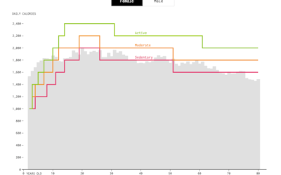
How Much We Eat vs. How Much We Need
On average, we use less energy as we age, and so we should eat less. We don’t always adjust soon enough though.
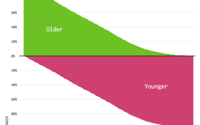
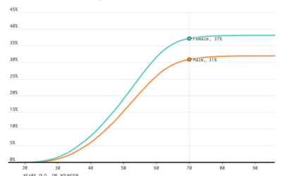
Who is Older and Younger than You (2014)
Here's a chart to show you how long you have until you start to feel your age.
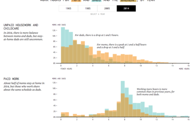
Shifting Parent Work Hours, Mom vs. Dad
Articles about stay-at-home dads and parents with even work loads might make it seem like dads are putting in a lot of hours in the household these days. Are they? How do they compare to moms' work hours?
Divorce Rates for Different Groups
We know when people usually get married. We know who never marries. Finally, it's time to look at the other side: divorce and remarriage.