James Grady from Fathom Information Design had a look at the family tree…
Nathan Yau
-
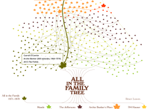
The family tree for All in the Family
-
Link
Try R →
Free online course from Code School for getting started with R
-
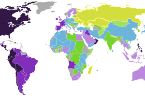
Emotion of countries mapped →
Max Fisher for the Washington Post mapped country emotion ratings, based on the…
-
Link
CartoDB 2.0 →
The “Instagram of maps” or more appropriately, works on mobile
-
Link
Simple chart, clear story →
Impact of vaccines plotted over time shows obvious impact [via]
-
Link
Cartograms in D3 →
Cartograms in D3. Way smooth and interactive.
-
Lunar Lander trails
In 1979, Atari released Lunar Lander, a game whose object was to land…
-
A new kind of resource
Jer Thorp talks ethics in the data-as-new-oil metaphor:
[W]e need to change the… -
Link
Finding image color palettes in R →
Use k-means to find most used colors
-
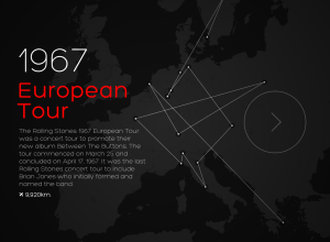
50 years of Rolling Stones tours
CartoDB mapped every Rolling Stones tour from 1963 to 2007.
The Stones passed… -
Link
Rcpp →
Write C++ code and easily connect with R for more speed [via]
-
Time-lapse writing of a research paper
A research paper version of Noah Kalina’s photo project by Timothy Weninger. Weninger…
-
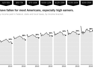
How tax rates have changed →
Mike Bostock, Matthew Ericson and Robert Gebeloff for the New York Times explored…
-
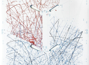
Pinball machine as Etch A Sketch
When you plan pinball, the ball bounces around creating paths for itself and…
-
Machines and built-in morality
With Google’s driverless cars now street legal in California, Florida, and Nevada, Gary…
-
Link
Building USA Today election night maps →
Detailed view of the underbelly of developing and launching maps for a large-scale publication
-
Link
The meaning of statistics and digital humanities →
Images as statistical summaries
-
Link
Teasing out the data →
Shy data and introducing it to new audiences
-
xkcd: Calendar of meaningful dates
Using the Google ngrams corpus, xkcd sized the days of the year based…
-
Link
Washington Post graphics →
There’s a new tumblr in town that discusses process and points to work
Recently for Members
Second Edition
 Visualize This: The FlowingData Guide to Design, Visualization, and Statistics (2nd Edition)
 Visualize This: The FlowingData Guide to Design, Visualization, and Statistics (2nd Edition)
New tools, refined process.
Browse by Chart Type See All →


