Mapping the Spread of Obesity

Obesity is on the rise. It has been for the past several decades. These days, about two-thirds of adults in the United States fall into the category of overweight or obese, classifications based on height and weight punched into a formula for Body Mass Index. While the calculation has its exceptions, like with athletes with high muscle-to-fat ratios, it provides a telling look from a generalized point of view.
Estimates come from the Centers for Disease Control and Prevention, which continually surveys Americans through the Behavioral Risk Factor Surveillance System. It’s been going on for more than three decades now, and data is available at the state level.
The maps below show increasing rates of adult obesity every year since 1985 to 2015. Gray squares indicate data that is not available for a state.
As one might expect, the maps start with higher obesity rates in the south, and then make their way across the country. In 2015, most states had an obesity rate greater than 30 percent. This trend started later for women than for men.
 Americans are Growing Bigger
See the full distributions for men and women for the same time frame.
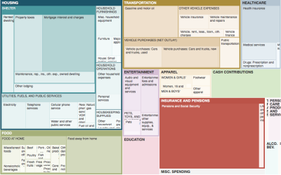
 The Changing American Diet
See what we ate on an average day, for the past several decades.
Nerd Notes
Chart Types Used


Become a member. Support an independent site. Get extra visualization goodness.
See What You Get