Income Increased
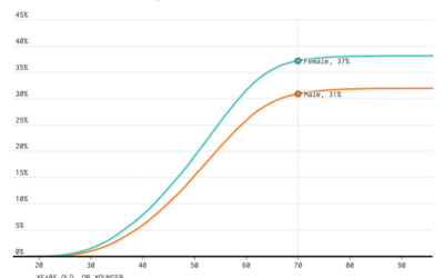
Last week the Census Bureau released their annual report on income and poverty in the United States. The main result: Median household income increased by 5.2 percent, which is the first annual increase since 2007. That’s great news. People found jobs, and people earned money to support their families.
The 5.2 is an estimate for all households though, and as you might expect, the numbers vary depending on what demographic group you look at. But again, the good news is that it was an increase for all groups.
Nerd Notes
Normally I’d use bars or dot-and-whisker to show range, but I felt like trying out these moving bars to show potential values for each estimate. The bar length varies across the estimate plus or minus the margin of error. I’m still deciding if it works.
I like that there’s more emphasis on uncertainty, as there’s no definite stopping point for each point, but it might be too much emphasis. Maybe it’d be more useful if the transition times and easing were based on the margin of error. Right now, transition time is random with linear easing.
Chart Type Used

Become a member. Support an independent site. Get extra visualization goodness.
See What You Get