How I Made That: Network Diagrams of All the Household Types
Process the data into a usable format, which makes the visualization part more straightforward.

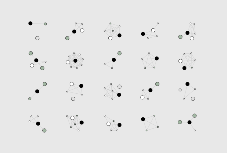
With visualization, there’s a lot of filtering and aggregation so that it’s easier to see general patterns. But lately I’ve been more curious about what we can see from visualizing everything. So I made network diagrams for 4,708 household types in the United States.
Here’s how I made them using Python and R.
To access this full tutorial, you must be a member. (If you are already a member, log in here.)
Get instant access to this tutorial and hundreds more, plus courses, guides, and additional resources.
Membership
You will get unlimited access to step-by-step visualization courses and tutorials for insight and presentation — all while supporting an independent site. Files and data are included so that you can more easily apply what you learn in your own work.
Learn to make great charts that are beautiful and useful.
Members also receive a weekly newsletter, The Process. Keep up-to-date on visualization tools, the rules, and the guidelines and how they all work together in practice.
See samples of everything you gain access to:


