Declining U.S. Births
As people marry later and have fewer kids, the number of births per month has been decreasing over the past decade. The pandemic seemed to speed up the process at first, but then jumped back up based on provisional data from the CDC.
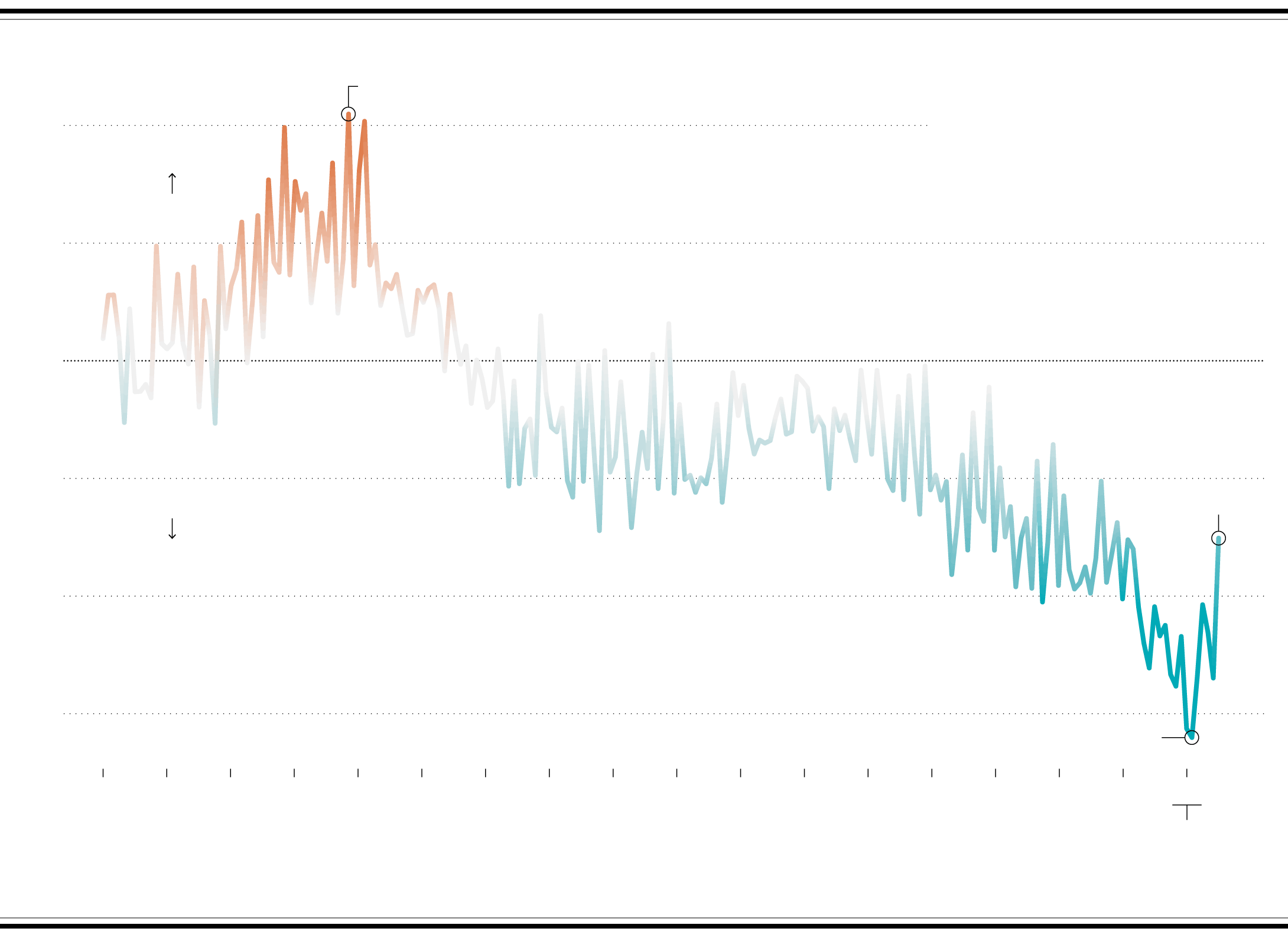
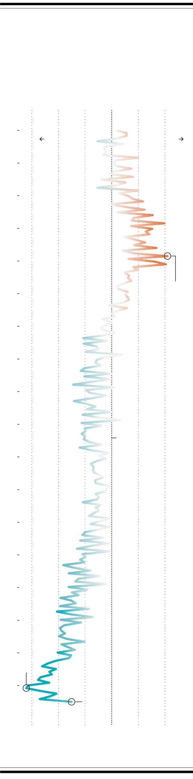
CHANGE IN LIVE BIRTH COUNT SINCE 2003
In November 2007, births peaked relatively at 353,660, which was 10% higher than during the same month in 2003.
FROM 2004 TO 2021
LIVE BIRTHS
+10%
COMPARED TO
MONTHLY COUNTS IN 2003
MORE BIRTHS
+5%
This baseline represents equal number of births to 2003 monthly counts.
0%
June 2021 births show a possible rise.
-5%
FEWER BIRTHS
-10%
Births have been going down for the past decade, but the pandemic pushed it down faster. Births in January 2021 were 16% lower than in 2003.
-15%
2004
2005
2006
2007
2008
2009
2010
2011
2012
2013
2014
2015
2016
2017
2018
2019
2020
2021
Data for 2021 is provisional. The counts these % changes are based on were rounded to the nearest thousand.
SOURCE: CDC NATIONAL CENTER FOR HEALTH STATISTICS / MADE BY: FLOWINGDATA
FROM 2004 TO 2021
LIVE BIRTHS
COMPARED TO
MONTHLY COUNTS IN 2003
CHANGE IN LIVE BIRTH COUNT SINCE 2003
-15%
-10%
-5%
0%
+5%
+10%
2004
FEWER BIRTHS
MORE BIRTHS
2005
2006
2007
2008
In Nov. 2007, births peaked relatively at 353,660, which was 10% higher than during the same month in 2003.
2009
2010
2011
2012
2013
This baseline represents equal number of births to 2003 monthly counts.
2014
2015
2016
2017
2018
Births were going down for the past decade, but the pandemic pushed it down faster. Births in Jan. 2021 were 16% lower than in 2003.
2019
2020
2021
June 2021 births show a possible rise.
SOURCE: CDC NATIONAL CENTER FOR HEALTH STATISTICS
MADE BY: FLOWINGDATA
Instead of using absolute counts per month, this baseline chart uses 2003 as the reference, which is the earliest the CDC currently provides monthly data through their WONDER database. Each point on the line shows the percentage difference in a given month compared to the corresponding month in 2003.
Chart Type Used

Become a member. Support an independent site. Get extra visualization goodness.
See What You Get