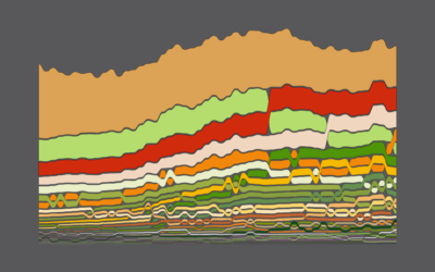
How Spending Changed for Different Income Groups
For The Atlantic, Dani Alexis Ryskamp wrote about how life in The Simpsons is no longer attainable. The argument was that Homer’s salary of $25,000 in 1996, after adjusting for inflation, would not be enough to afford the Simpsons house, healthcare, etc. for a family of four.
Naturally, that got me thinking about how spending and expenses changed between 1996 and now, specifically for different income groups.
The Bureau of Labor Statistics keeps track of such things through the Consumer Expenditure Survey. They’ve released official numbers through 2019, so I compared 1996 against that.
The categories are roughly ordered from increased spending to decreased spending. So you see by how much the cost of housing and healthcare has gone up over a couple of decades, especially for the lower income groups.
For the lowest income quintile, housing and healthcare make up more than half of spending on average.
In contrast, the higher income groups are spending more in retirement savings, education, and entertainment, and their cost of housing changed little.
Chart Type Used

Become a member. Support an independent site. Make great charts.
See What You Get