Best Data Visualization Projects of 2018
Every year I choose my favorite visualization projects. Looking back at old picks over the decade, a part of me longs for a simpler, more playful time when data graphics were used to tell jokes and show neat things.
The other part of me sees visualization that matured over the years and developed into a medium rather than a form of commercial eye candy. There’s less focus on visualization the tool and more focus on how to use the tools. That’s a good thing.
Of course, there’s no reason we can’t have it all. Here are my picks for the best visualization projects of 2018, in no particular order.
Best Shine of Light
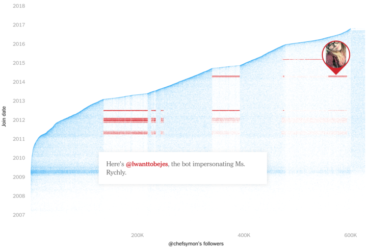
The Follower Factory
There are many reasons to like this New York Times project by Nicholas Confessore, Gabriel J.X. Dance, Richard Harris, and Mark Hansen. The analysis. The visuals. The change it forced on Twitter and social media in general. I liked it best for showing concretely what most people probably only had a hunch about, and thus making them care. [See the Project / On FlowingData]
Best Recreation of Vintage Data Graphics
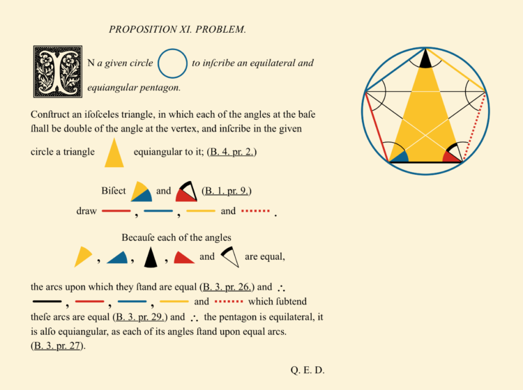
Byrne’s Euclid
There’s just something about vintage graphics that always draws me in. Maybe it’s the yellow-brown background. Nicholas Rougeux recreation of Byrne’s Euclide brought that vintage aroma along with modern updates. [See the Project / On FlowingData]
Best Scratching of an Itch
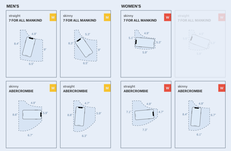
Women’s Pockets are Inferior
I like data projects that spawn from deep, everyday curiosities, but you know what’s better? Projects spurred by everyday annoyances. Jan Diehm and Amber Thomas for The Pudding attacked their pant pocket annoyance head-on. [See the Project / On FlowingData]
Best Use of Scale in Perspective
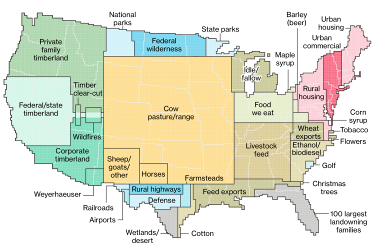
Here’s How America Uses Its Land
Compare something we’re unfamiliar with against something we are familiar with. It’s a common visual device to show the scale of things. I liked Dave Merrill and Lauren Leatherby take on showing land use. [See the Project / On FlowingData]
Runner-up
Lauren Tierney for The Washington Post compared the size of California wildfires against the location of your choosing. A grim topic, but the aesthetics is tops. [See the Project / On FlowingData]
Best Use of Visual Metaphor
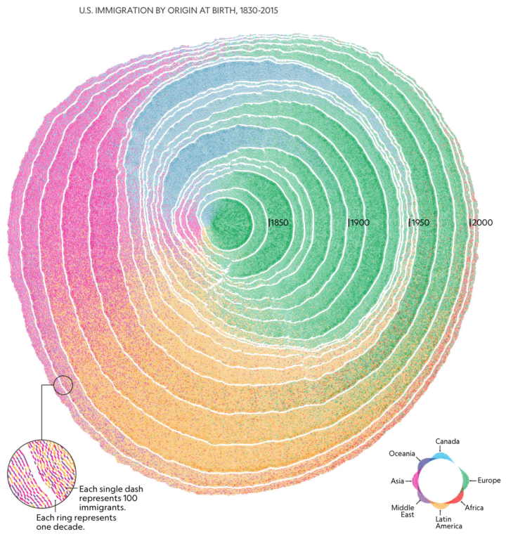
200 Years of U.S. Immigration Looks Like the Rings of a Tree
By Pedro M. Cruz, John Wihbey, Avni Ghael and Felipe Shibuya, this graphic showed a topic that we saw many times before but showed it under a new light. The tree ring metaphor shows a full history as well as the variation in between. [See the Project / On FlowingData]
Runner-up
The New York Times used a bucket o’ blobbies to show Apple’s $1 trillion milestone. It was a delightful surprise. [See the Project / On FlowingData]
Best Explanation of Nerdy Topic
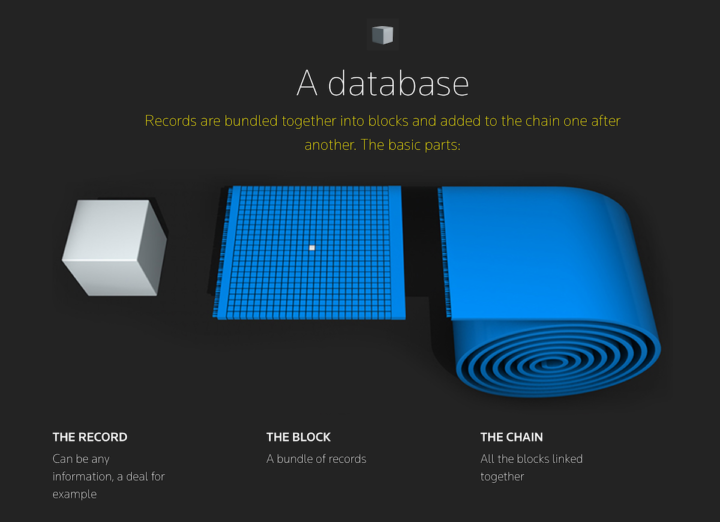
Blockchain explained
It seems like ages ago since blockchain (Bitcoin especially) was in the general public’s ear. Maryanne Murray and team for Reuters gave me something I could point family members to. [See the Project / On FlowingData]
Best Map of Data that Looks Like a Physical Representation
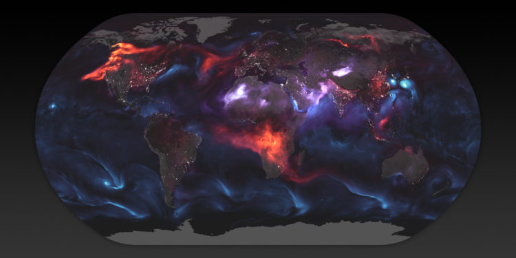
Just Another Day on Aerosol Earth
From Joshua Stevens for the NASA Earth Observatory. So gassy. So good. [See the Project / On FlowingData]
Runner-up
Tim Meko and Aaron Steckelberg for The Washington Post used terrain height and color to represent rainfall in the United States. I wanted to reach out and touch my computer screen. [See the Project / On FlowingData]
Best Statistical Explainer
Model Tuning and the Bias-Variance Tradeoff
Machine learning is kind of thing now. Stephanie Yee and Tony Chu, in their second installment, explained how bias can easily creep into the “objective” computer’s algorithms. [See the Project / On FlowingData]
Runner-up
Adam Pearce for The New York Times went to town on train delays and overcrowding. [See the Project / On FlowingData]
Second Runner-up
While not quite an explainer, the Olympic medal piece by Josh Katz for The New York Times did a fine job showing how weights change the ranking the of countries. [See the Project / On FlowingData]
Best Weird Use of Machine Learning
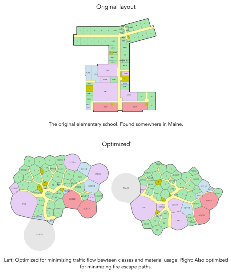
Evolving Floorplans
Joel Simon used genetic algorithms to “optimize” floor plans, and the results were weird and amusing. [See the Project / On FlowingData]
Runner-up
Janelle Shane generated knitting patterns, and then actual knitters brought the patterns to life. [See the Project / On FlowingData]
Best Back-of-the-Napkin Math
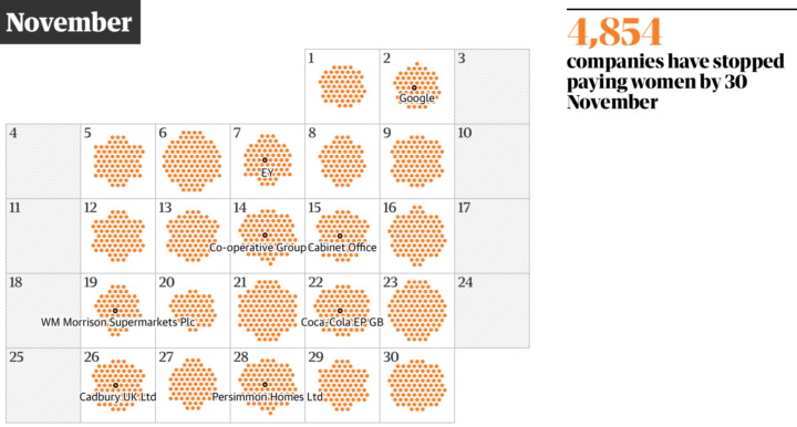
Gender pay gap: when does your company stop paying women in 2018?
The calendar view is based on median hourly pay, so it misses some variation. However the trend across thousands of companies makes for an effective point of view. [See the Project / On FlowingData]
Best Straightforward Yet Effective
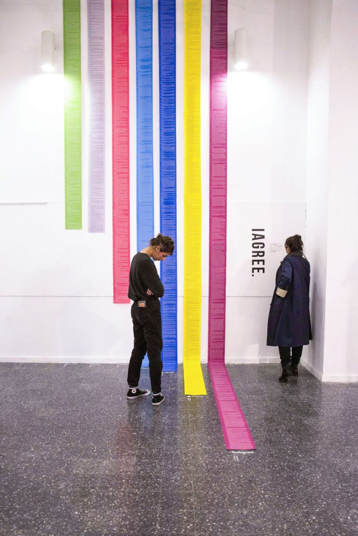
I Agree
Most people ignore the terms and conditions on account creations. So Dima Yarovinsky printed them out. [See the Project / On FlowingData]
Become a member. Support an independent site. Get extra visualization goodness.
See What You Get
