How Different Income Groups Spend Money

It’s like the more money we come across, the more problems we see.
—The Notorious B.I.G.
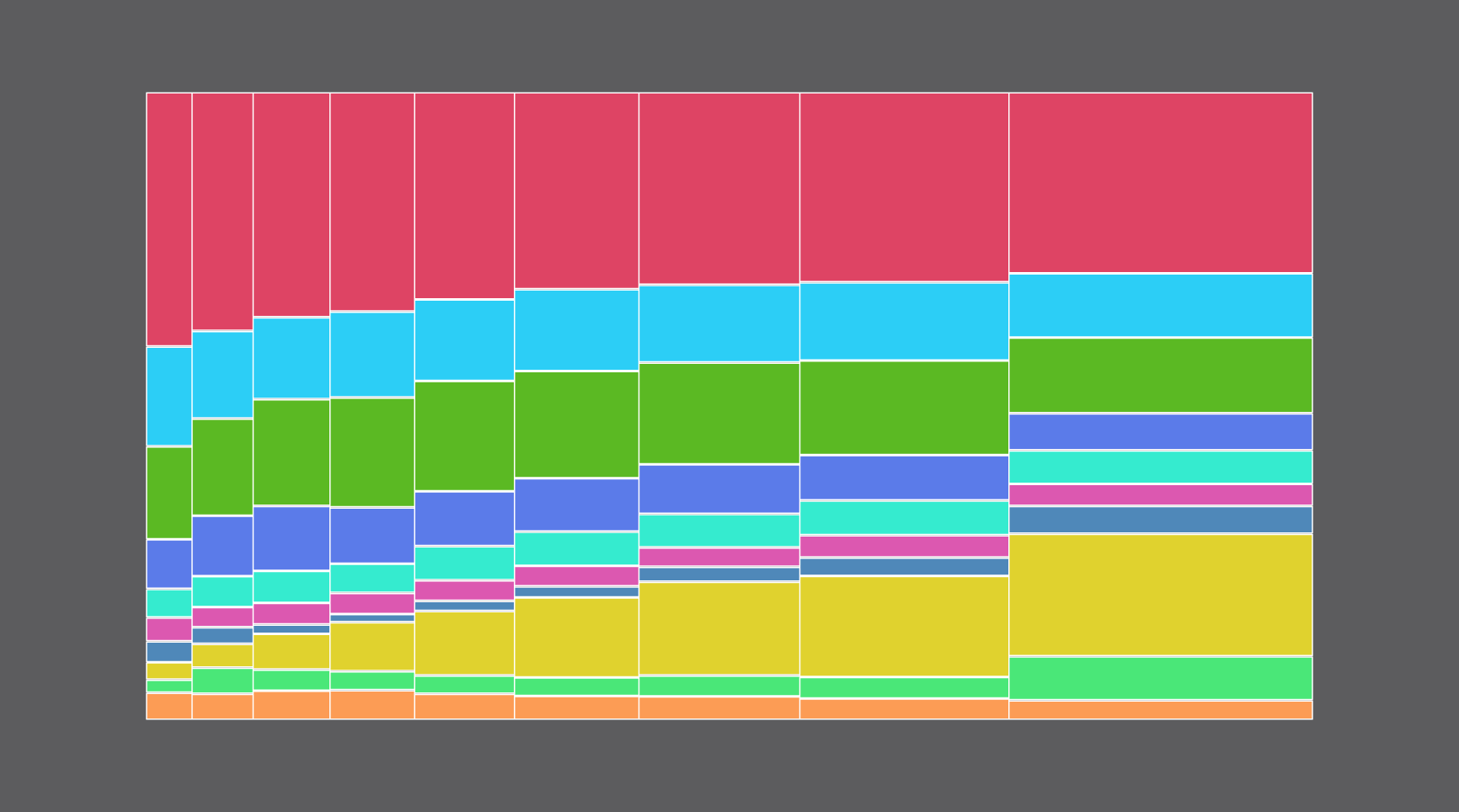
When you don’t make much money, your focus is on housing, food, and important things like staying alive. However, as income increases and you can more easily cover living expenses, the extra cash goes elsewhere.
I remember being a poor graduate student, and a friend a couple years ahead of me had been working a six-figure job already. My spending radar was on two-dollar taco night at Rubio’s at the time. So any extra spending money was foreign to me.
I asked, “What do you do with that?”
He replied, “You find ways to spend it.”
But on what? Here’s what people spend their money on in a year, grouped by income level. The numbers are based on estimates from the 2016 Consumer Expenditure Survey, which the Bureau of Labor Statistics runs annually.
Overall Spending
Here’s how different income groups spend their money each in a year. Reading up and down, you get percentage breakdowns, and reading across you get average annual spending.

INCOME GROUP
More than $200k
$100k to <$150k
$150k to <$200k
AVERAGE ANNUAL SPENDING
$70k to <$100k
Less than $15k
$40k to <$50k
$50k to <$70k
$15k to <$30k
$30k to <$40k
Percentage of average income
Average dollar amount spent
Housing
Food and Beverage
Transportation
Health Care
Entertainment
Apparel and Services
Education
Personal Insurance & Pensions
Cash Contributions
Other
$24k
$32k
$40k
$44k
$52k
$65k
$84k
$110k
$159k
AVERAGE TOTAL SPENDING PER YEAR FOR EACH INCOME GROUP

AVERAGE ANNUAL SPENDING
Percentage of average income
Average dollar amount spent
More than $200k
$100k to <$150k
$150k to <$200k
$70k to <$100k
Less than $15k
$30k to <$40k
$40k to <$50k
$15k to <$30k
$50k to <$70k
Housing
Food and Beverage
Transportation
Health Care
Entertainment
Apparel and Services
Education
Personal Insurance & Pensions
Cash Contributions
Other
$24k
$32k
$40k
$44k
$52k
$65k
$84k
$110k
$159k
AVERAGE SPENDING FOR EACH INCOME GROUP
Notice how the averages for total spending for the lower income groups are greater than the upper limits of the income levels? On average, people in these groups spend more money than they make.
Let’s look closer at each of the larger spending categories.
Housing
Buying a house made me feel all grown up suddenly. I expected a similar, sudden jump here. That’s not the case. The growth is pretty steady for spending related to owning a house. As expected, rent spending goes down with income.

INCOME GROUPS
Less
than
$15k
$15k
to
<$30k
$30k
to
<$40k
$40k
to
<$50k
$50k
to
<$70k
$70k
to
<$100k
$100k
to
<$150k
$150k
to
<$200k
More
than
$200k
Owning
One square equals $100.
As expected, people with more income spend more on home ownership…
$20,700
…and less on renting.
Renting
$4,700

INCOME GROUPS
More than $200k
$100k to <$150k
$150k to <$200k
$70k to <$100k
Less than $15k
$15k to <$30k
$30k to <$40k
$40k to <$50k
$50k to <$70k
Owning
One square equals $100.
As expected, people with more income spend more on home ownership and less on renting. With more property comes higher costs to run and maintain the household.
Renting
Utilities
Household Operations
Household Furnishings
Housekeeping Supplies

INCOME GROUPS
Less
than
$15k
$15k
to
<$30k
$30k
to
<$40k
$40k
to
<$50k
$50k
to
<$70k
$70k
to
<$100k
$100k
to
<$150k
$150k
to
<$200k
More
than
$200k
Utilities
With more property comes higher costs to run and maintain the household.
$6,500
Household Operations
$4,800
Household Furnishings
$5,400
Housekeeping Supplies
$1,100
Food and Beverages
More people spend more on food at home than food away from home, but once you reach the second to highest income level, spending on food away from home takes the lead.

INCOME GROUPS
Less
than
$15k
$15k
to
<$30k
$30k
to
<$40k
$40k
to
<$50k
$50k
to
<$70k
$70k
to
<$100k
$100k
to
<$150k
$150k
to
<$200k
More
than
$200k
Food at Home
One square equals $100.
$7,100
Food Away From Home
Most people spend more on food at home, but by the $150,000 to $200,000 group, more is spent on food away away from home.
$8,900
Alcoholic Beverages
$1,600

INCOME GROUPS
More than $200k
$100k to <$150k
$150k to <$200k
$70k to <$100k
Less than $15k
$15k to <$30k
$30k to <$40k
$40k to <$50k
$50k to <$70k
Food at Home
One square equals $100.
Food Away From Home
Most people spend more on food at home, but by the $150,000 to $200,000 group, more is spent on food away away from home.
Alcoholic Beverages
Transportation
The increasing pattern continues with vehicle purchases and maintenance. Spending on travel spikes.

INCOME GROUPS
Less
than
$15k
$15k
to
<$30k
$30k
to
<$40k
$40k
to
<$50k
$50k
to
<$70k
$70k
to
<$100k
$100k
to
<$150k
$150k
to
<$200k
More
than
$200k
Vehicle Purchases
One square equals $100.
This is for net outlay, which is purchase price minus trade-in value.
$7,500
Gasoline and Motor Oil
$2,900
Public and Other Transportation
This category includes airlines, and I’m guessing the extra spending comes from travel.
$2,900

INCOME GROUPS
More than $200k
$100k to <$150k
$150k to <$200k
$70k to <$100k
Less than $15k
$15k to <$30k
$30k to <$40k
$40k to <$50k
$50k to <$70k
Vehicle Purchases
One square equals $100.
Gasoline and Motor Oil
Public and Other Transportation
This category includes airlines, and I’m guessing the extra spending comes from travel.
Health Care
At this point, you’re probably familiar with the increased spending in each category as you increase the income.

INCOME GROUPS
Less
than
$15k
$15k
to
<$30k
$30k
to
<$40k
$40k
to
<$50k
$50k
to
<$70k
$70k
to
<$100k
$100k
to
<$150k
$150k
to
<$200k
More
than
$200k
Health Insurance
One square equals $100.
$6,600
Medical Services
$1,900
Drugs and Medical Supplies
$1,100

INCOME GROUPS
More than $200k
$100k to <$150k
$150k to <$200k
$70k to <$100k
Less than $15k
$15k to <$30k
$30k to <$40k
$40k to <$50k
$50k to <$70k
Health Insurance
One square equals $100.
Medical Services
Drugs and Medical Supplies
Personal Insurance and Pensions
Here is the most dramatic difference by far. People with higher incomes have a lot more money to save after they pay for living expenses, percentage-wise and in average dollars.

INCOME GROUPS
Less
than
$15k
$15k
to
<$30k
$30k
to
<$40k
$40k
to
<$50k
$50k
to
<$70k
$70k
to
<$100k
$100k
to
<$150k
$150k
to
<$200k
More
than
$200k
Pensions and Social Security
One square equals $100.
After living expenses are covered, people save for retirement, and of course, those with higher incomes can afford to save much more. Percentage-wise, this is the biggest spending difference by far between the low- and high-income groups.
$29,800
Life and Other Personal Insurance
$1,200

INCOME GROUPS
More than $200k
$100k to <$150k
$150k to <$200k
$70k to <$100k
Less than $15k
$15k to <$30k
$30k to <$40k
$40k to <$50k
$50k to <$70k
Pensions and Social Security
One square equals $100.
After living expenses are covered, people save for retirement, and of course, those with higher incomes can afford to save much more. Percentage-wise, this is the biggest spending difference by far between the low- and high-income groups.
Life and Other Personal Insurance
Notes
- The data comes from the Consumer Expenditure Survey, which is run by the Bureau of Labor Statistics. They offer a number of aggregated cross-sections. You can also download the microdata, but it’s not weighted for all states yet.
- I made these charts in R with a variation of this unit chart tutorial. I edited in Illustrator. Mostly though, this was an excuse to figure out how to use ai2html the right way with my site setup.
Become a member. Support an independent site. Get extra visualization goodness.
See What You Get


