A Day in the Life of Americans

From two angles so far, we’ve seen how Americans spend their days, but the views are wideout and limited in what you can see.
I can tell you that about 40 percent of people age 25 to 34 are working on an average day at three in the afternoon. I can tell you similar numbers for housework, leisure, travel, and other things. It’s an overview.
What I really want to see is closer to the individual and a more granular sense of how each person contributes to the patterns. I want to see how a person’s entire day plays out. (As someone who works from home, I’m always interested in what’s on the other side.)
So again I looked at microdata from the American Time Use Survey from 2014, which asked thousands of people what they did during a 24-hour period. I used the data to simulate a single day for 1,000 Americans representative of the population — to the minute.
More specifically, I tabulated transition probabilities for one activity to the other, such as from work to traveling, for every minute of the day. That provided 1,440 transition matrices, which let me model a day as a time-varying Markov chain. The simulations below come from this model, and it’s kind of mesmerizing.
Each dot represents a person, color represents the activity, and time of day is shown in the top left. As someone changes an activity, say from sleep to a morning commute, the dot moves accordingly.
Following the timeline of the ATUS, the simulation starts at 4:00am and runs through 24 hours. The day starts with little movement as people are asleep and won’t wake up for a few hours. For most, the day starts at 7:00am and then it’s off to the races (which is especially fun to see on the fast speed).
You see people head to work, run errands, do housework, take care of the kids, commute, relax, and eat at almost designated times during the day. I stared at these dots longer than I care to admit.
Although with all 1,000 dots floating around it can be a challenge to keep track of where all those people went.
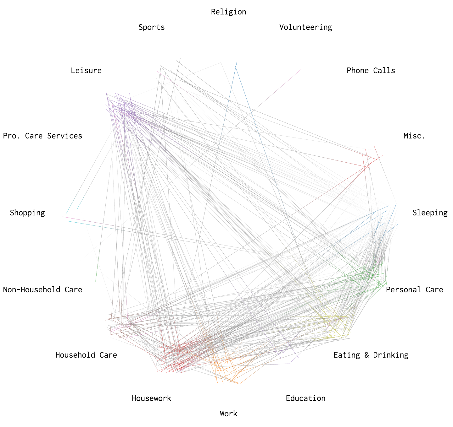
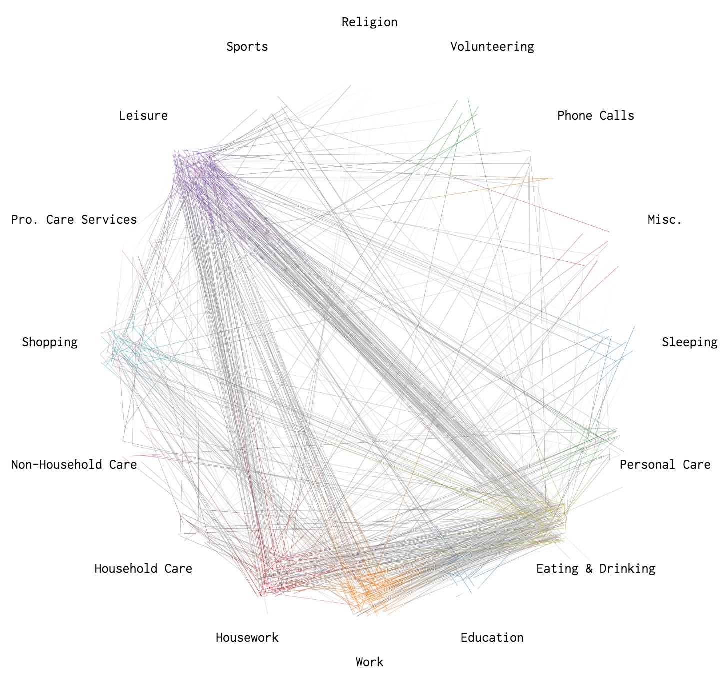
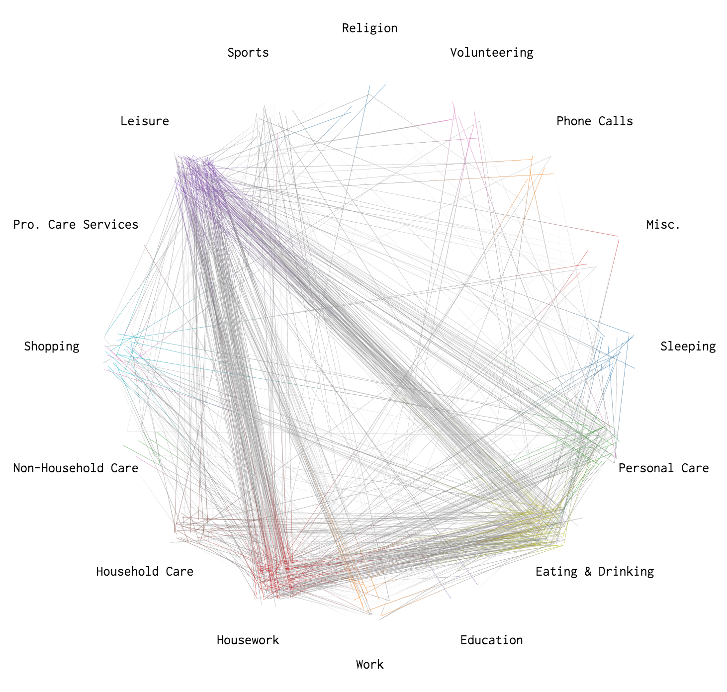
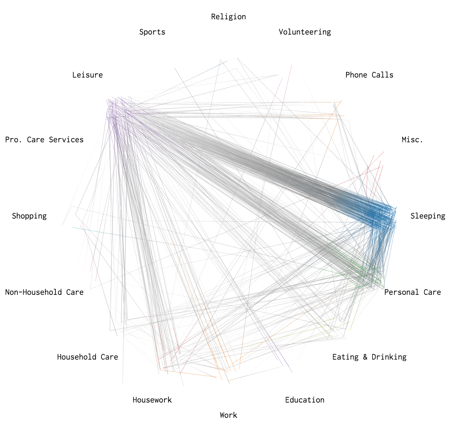
So I drew lines to show the paths.
In the graphics that follow, colors represent paths ending in that activity. Traveling is not included to make activity changes more obvious.
Waking up
Between 6:30am and 7:30am, most people wake up, head into personal care such as showering and brushing teeth, and then head to work, eat breakfast, relax for a bit, and do housework.
Lunch hour
From noon to 1:00pm, you see a lot of movement from work or housework to eating and drinking and then back again. Many also take the time to relax.
Getting off work
As you might expect, once the clock strikes 5:00pm, people head home to prepare and/or eat dinner.
Winding down
Between 10:00pm and midnight, people wind down for the day, shifting from leisure to personal care and eventually going to sleep.
 This is an American Workday, By Occupation
When and where people work, a simulation.
 Most Common Activities
See the half-hour breakdowns for a day, by sex and age group.
 Make a Moving Bubbles Chart to Show Clustering and Distributions
Here’s how to make a chart similar to this one.
Become a member. Support an independent site. Make great charts.
See What You GetFlowingData is made possible by supporting members. Since 2007, I, Nathan Yau, a real person, have been analyzing and visualizing data to help more people understand and appreciate it in their everyday lives.
If you liked this or want to make similar data things, please consider supporting this small corner of the internet. You get unlimited access to visualization courses, tutorials, and extra resources. Thanks. — Nathan
Chart Types Used

